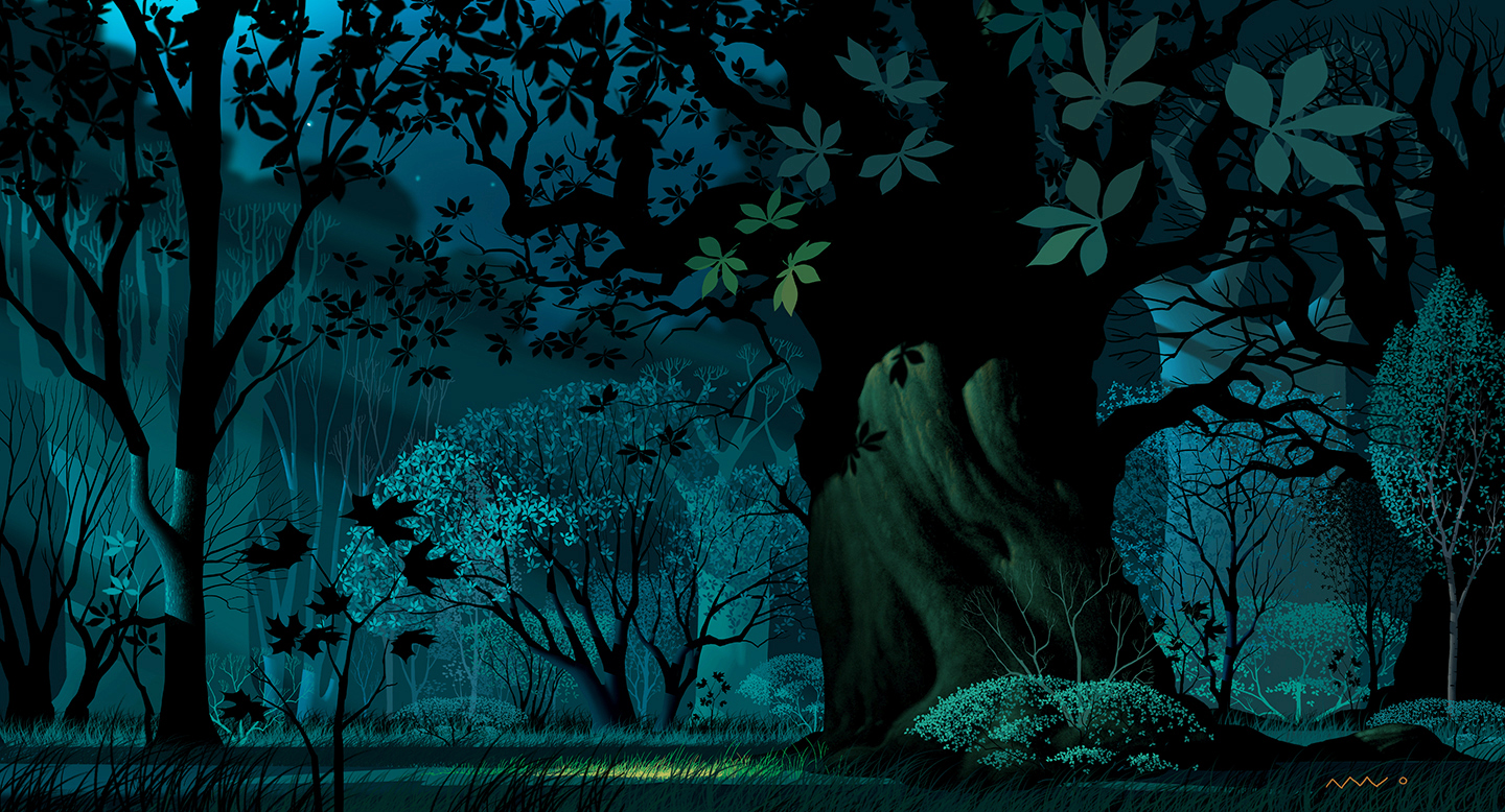
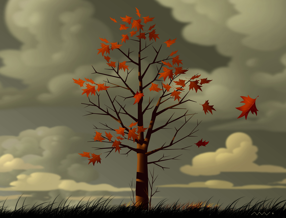
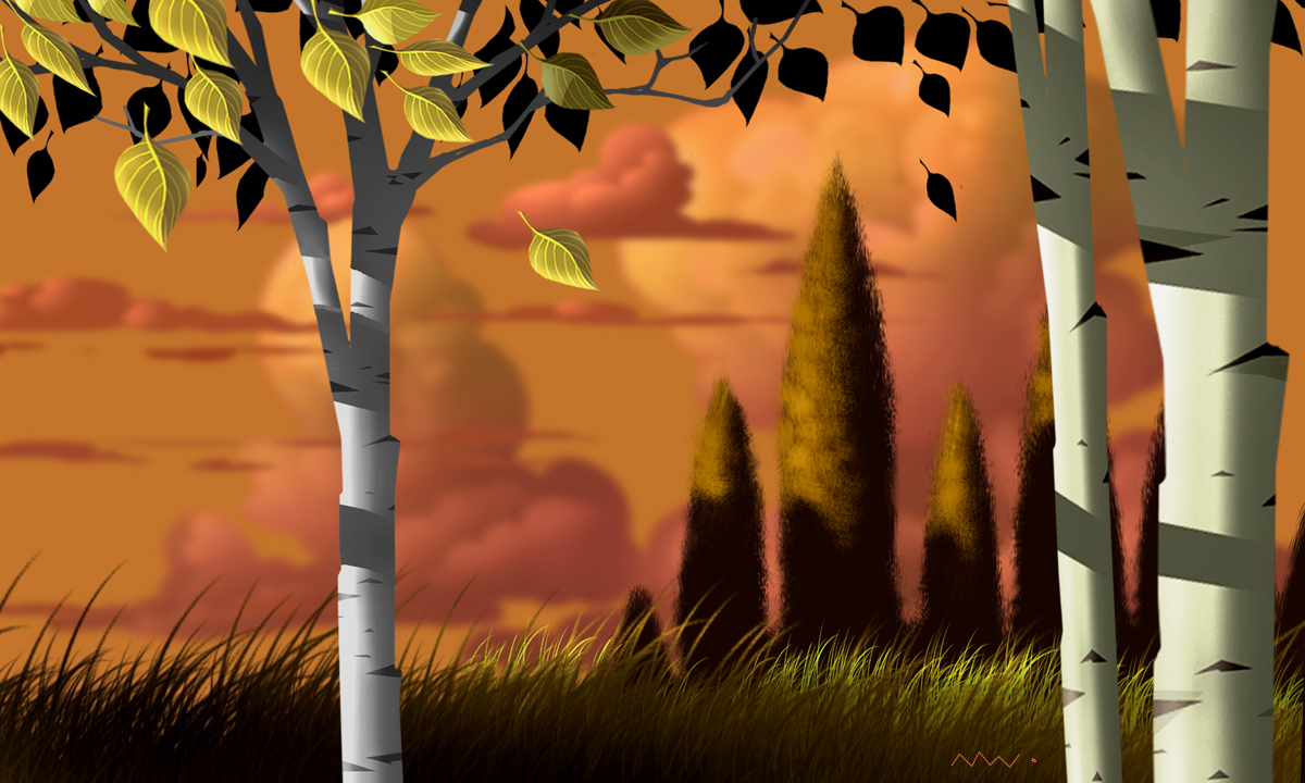
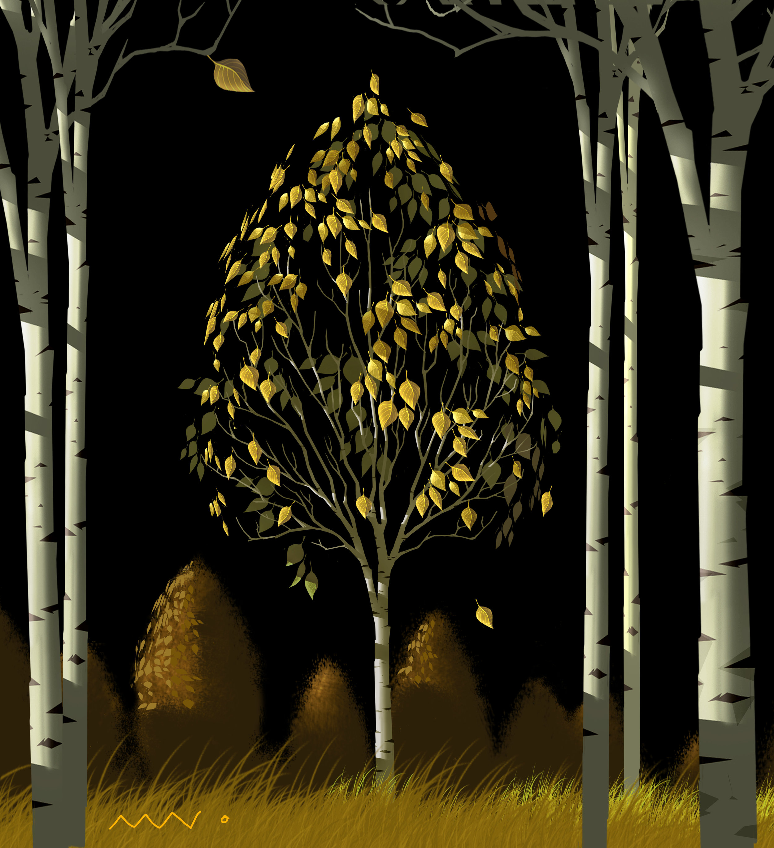
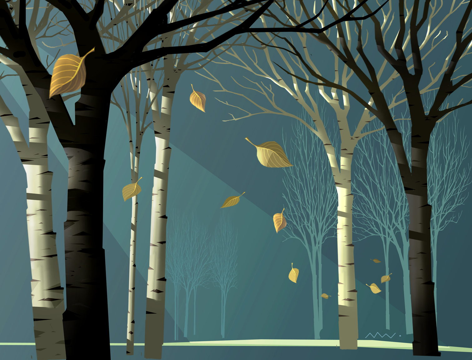


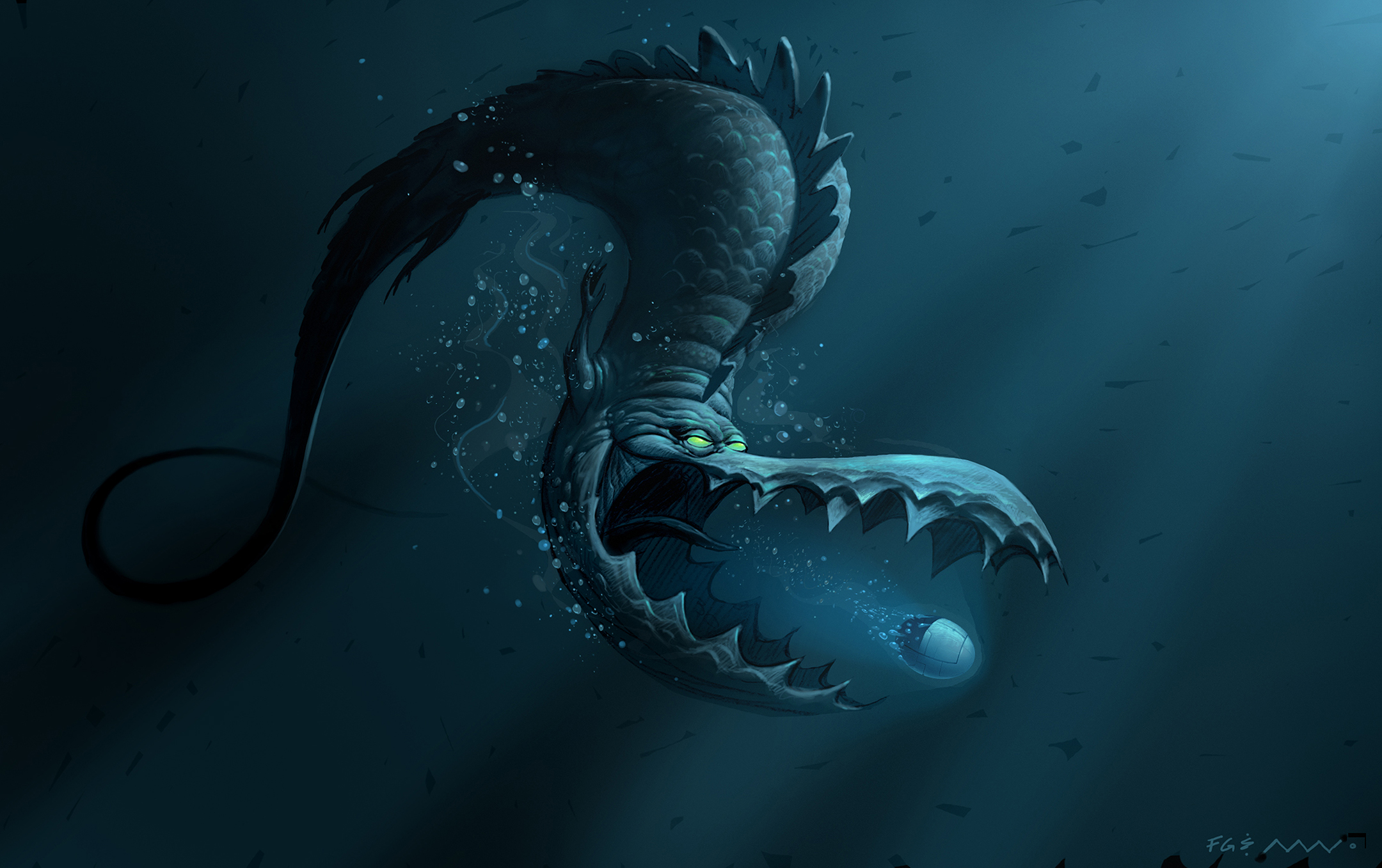





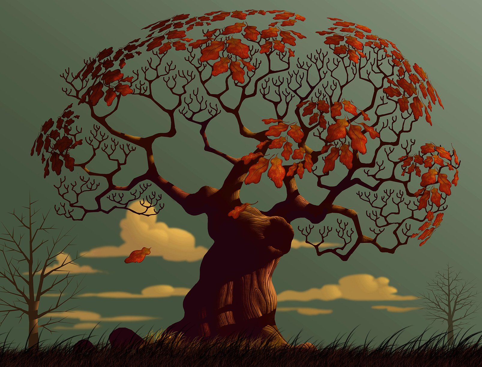
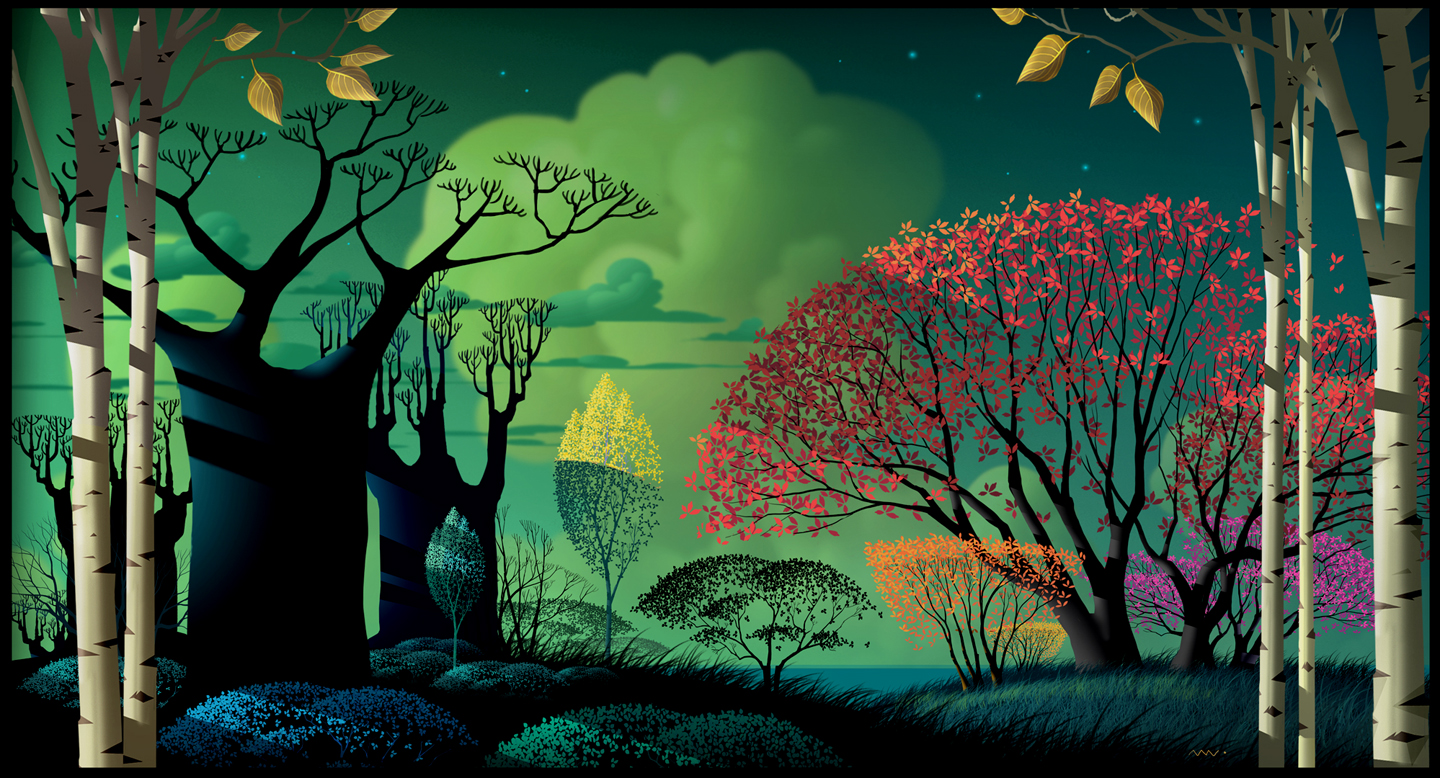
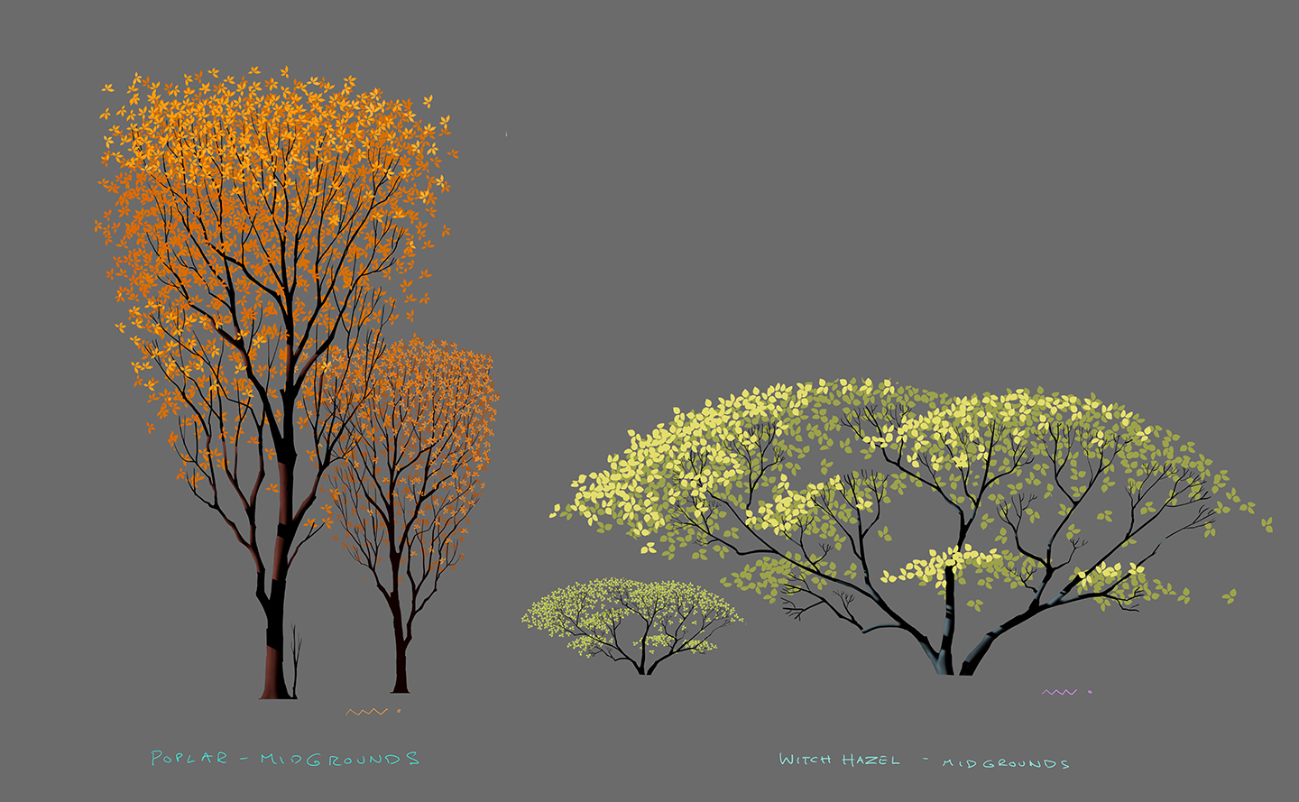
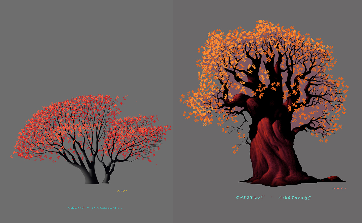







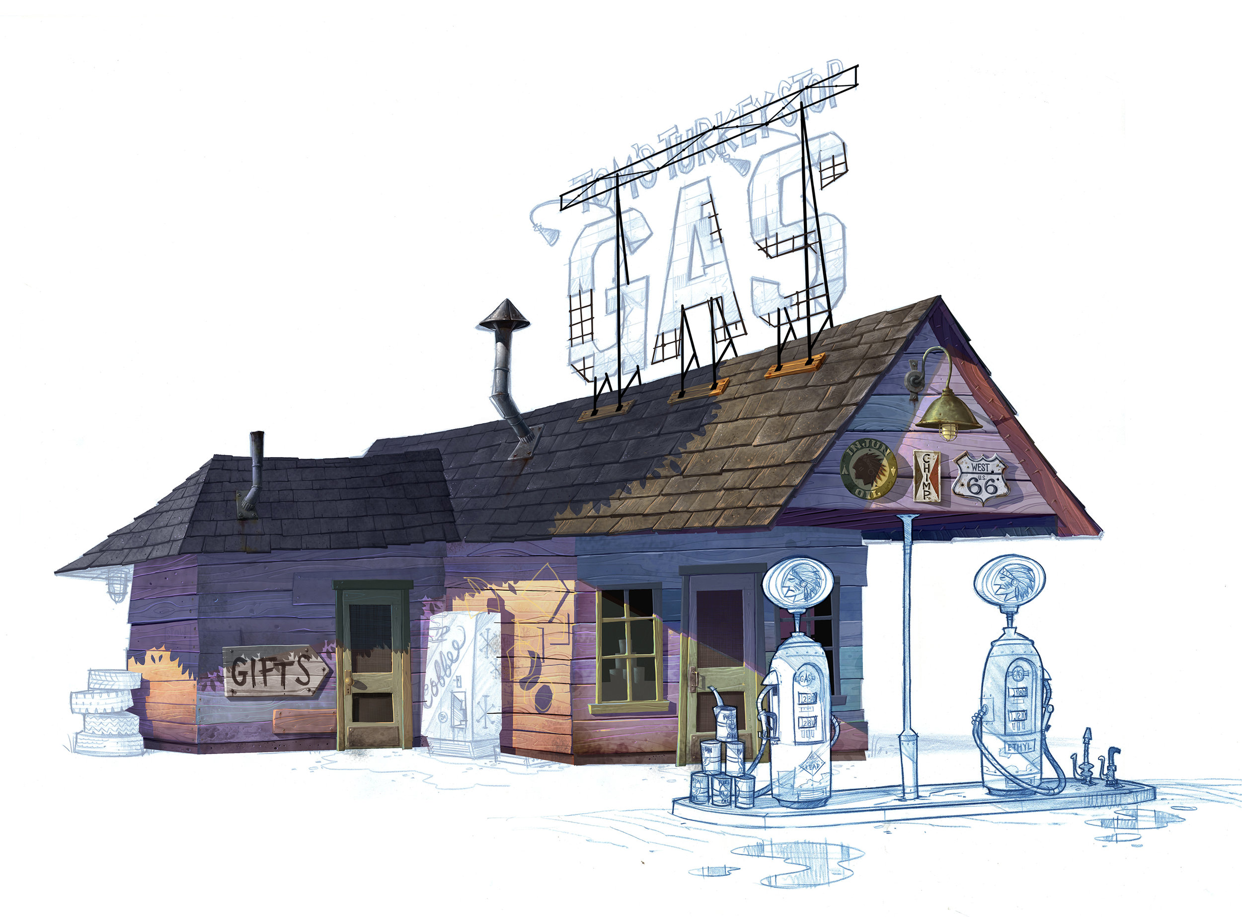

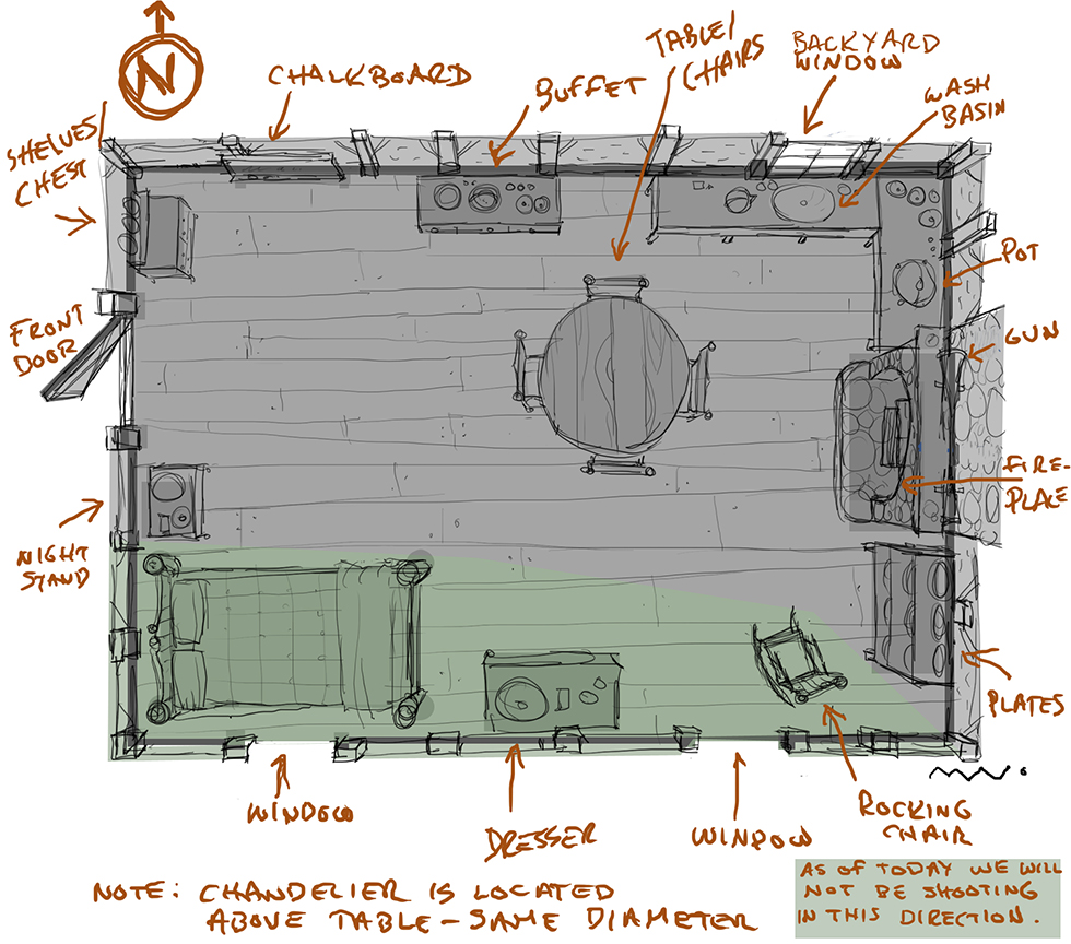
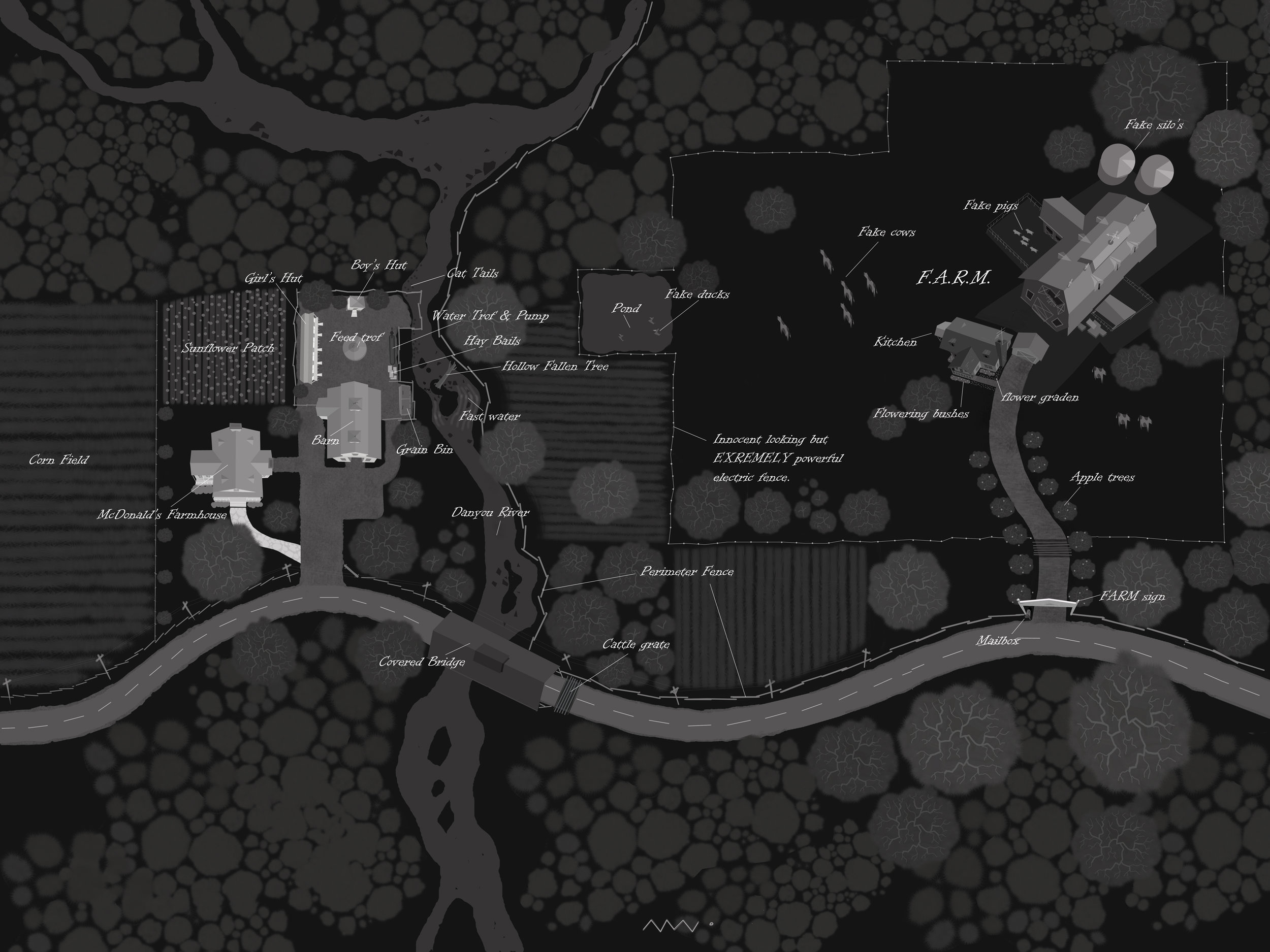





Digital painting.
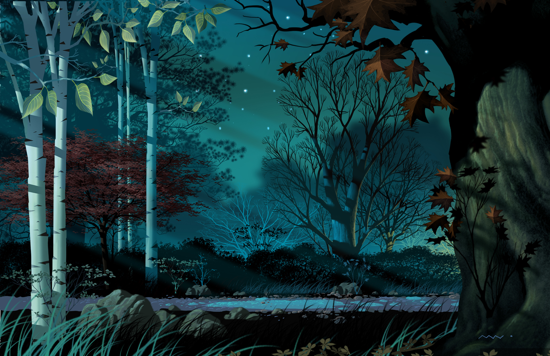
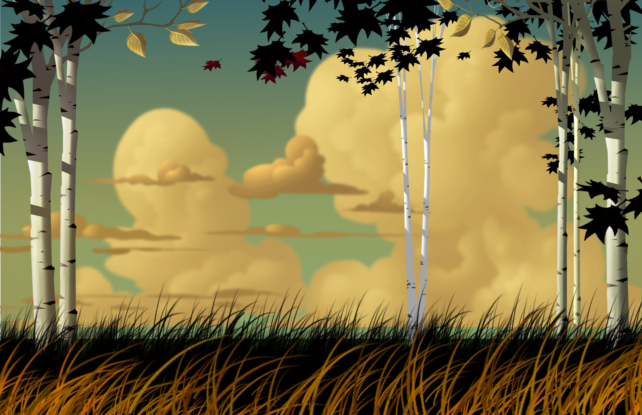
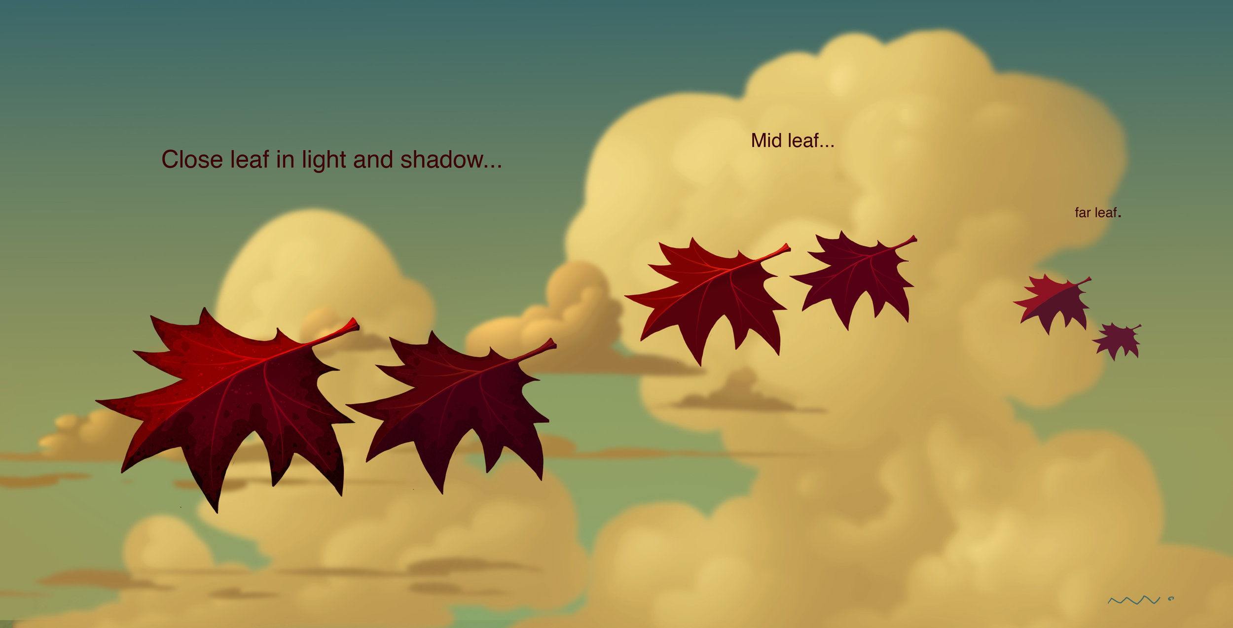
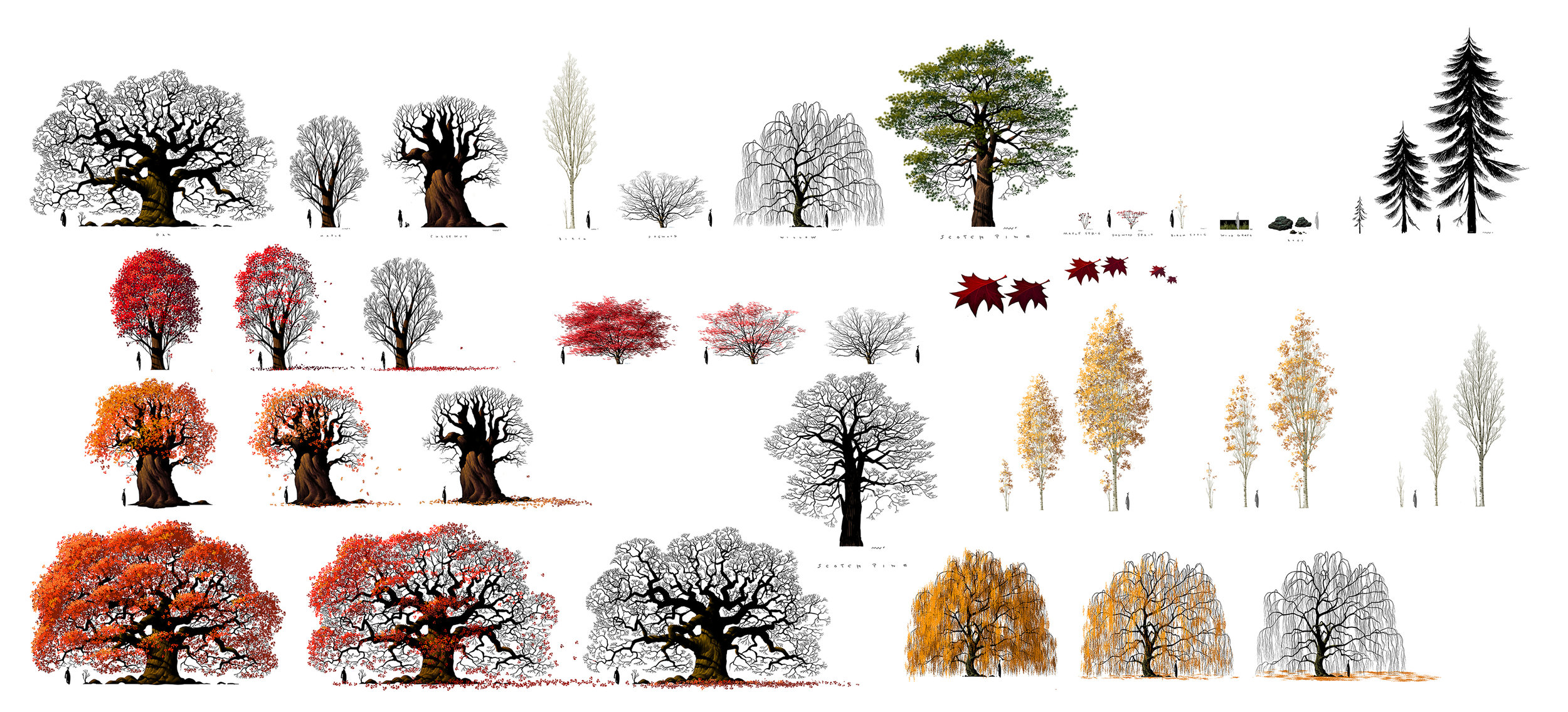
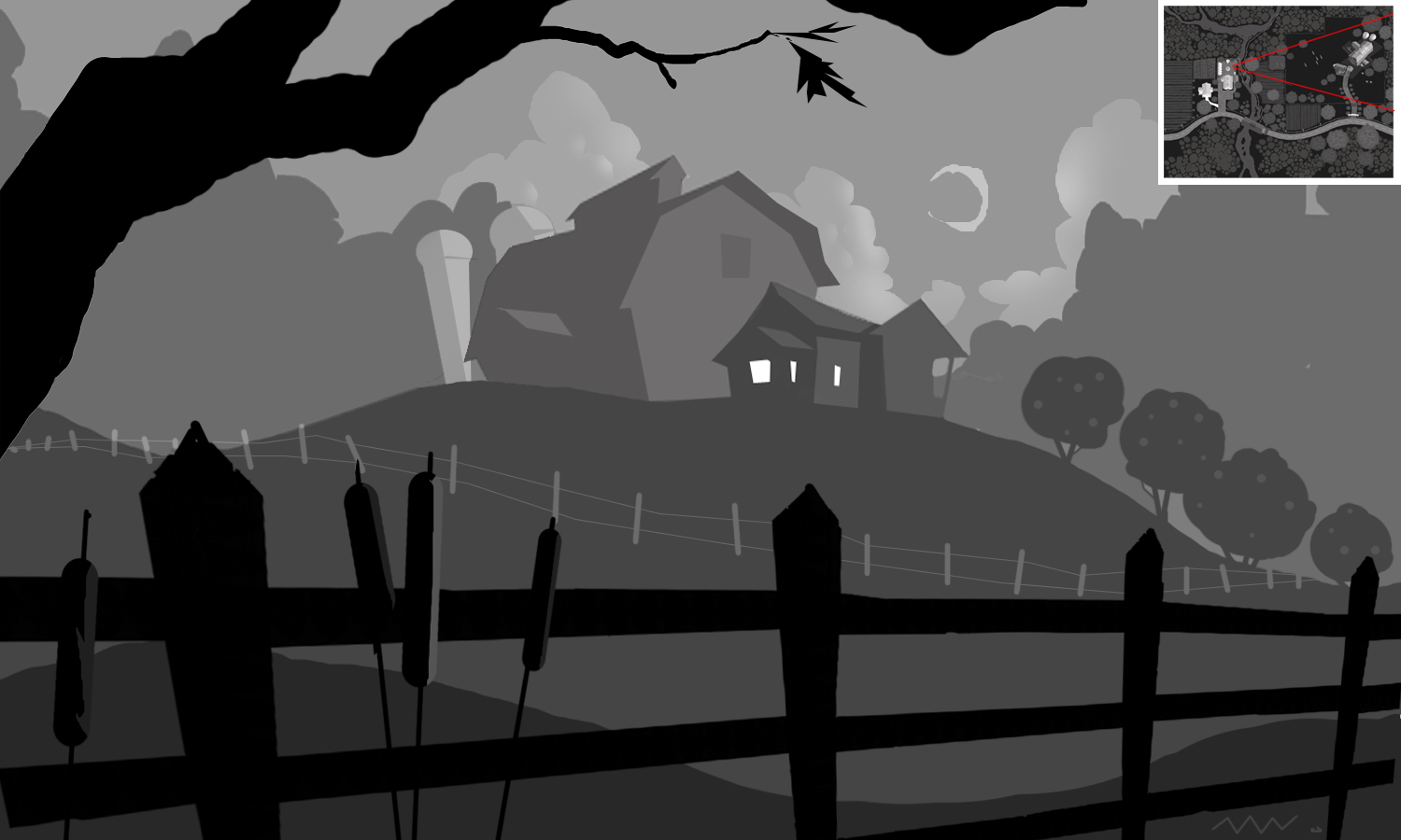
I was trying for a look that was graphic but also rich in depth. Being efficient with mostly flat silhouetted trees in anticipation of long render times associated with more complex objects. This looked particularly groovy with stereo goggles.

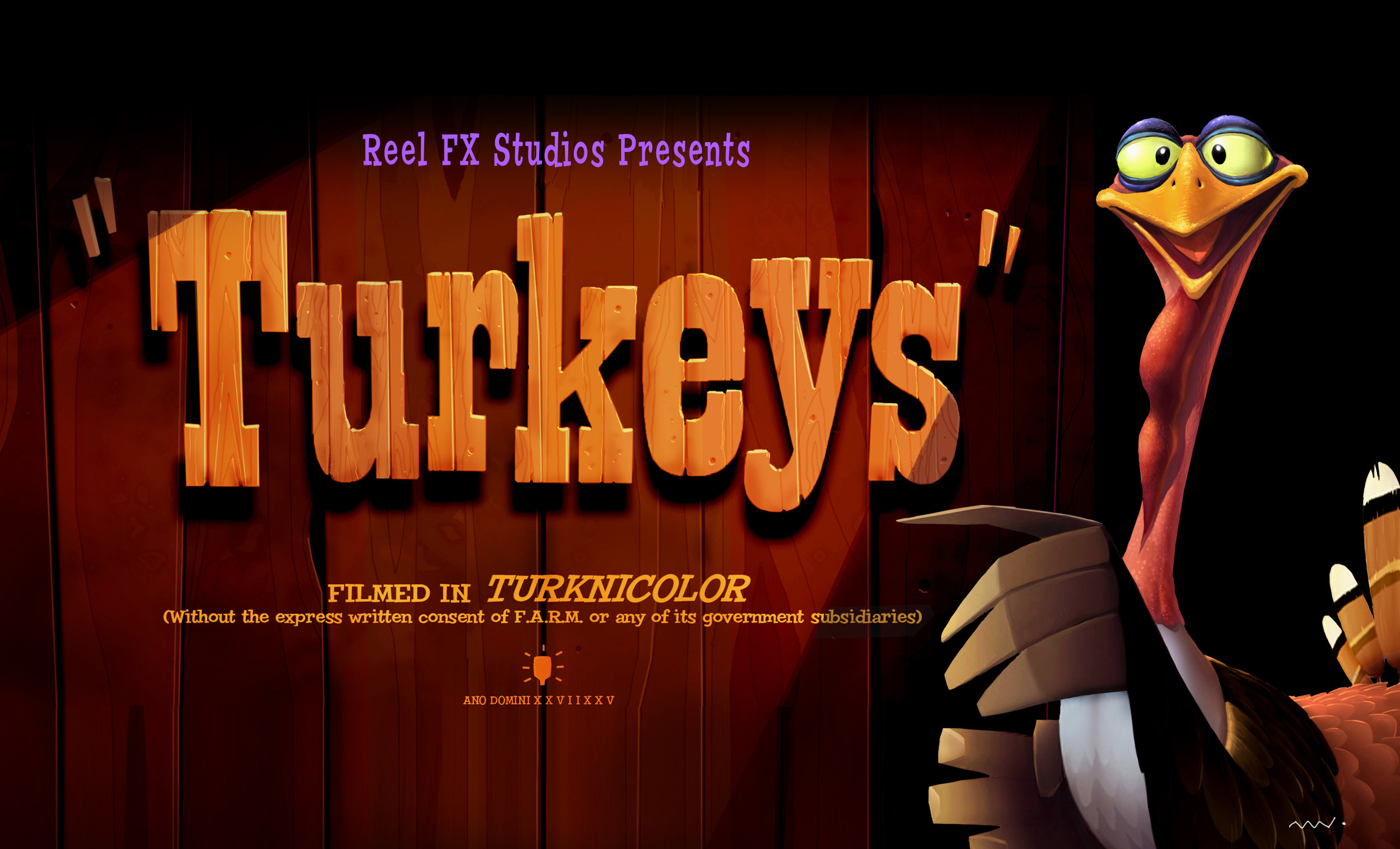
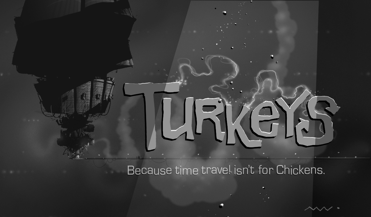
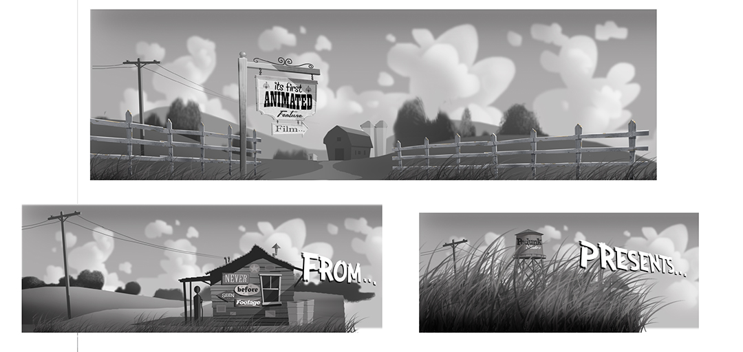
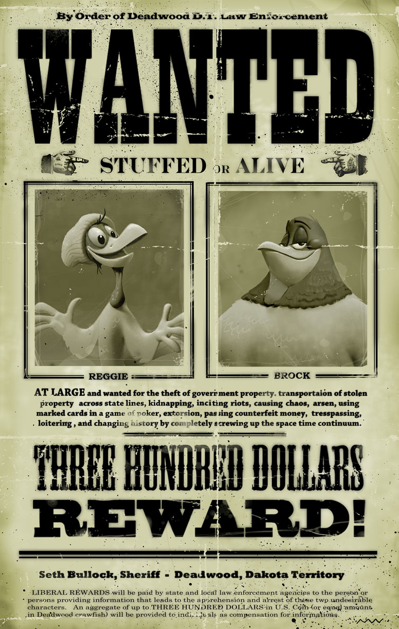
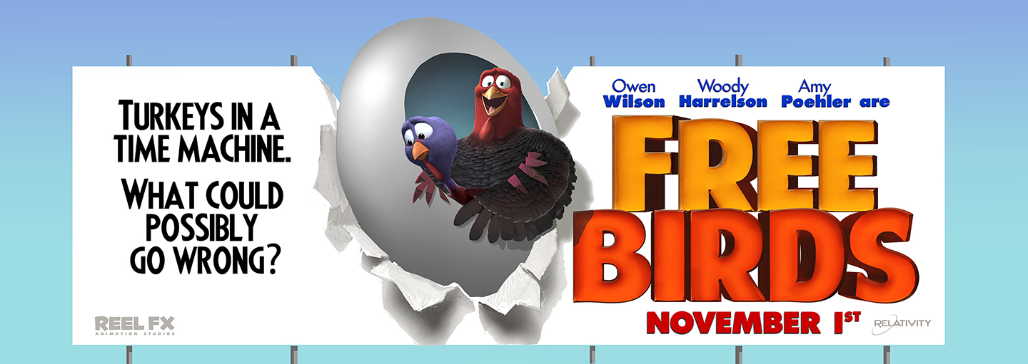
Logo design and painting. FREE BIRDS aka TURKEYS aka TIME TURKEYS title design. Old schooly when we were maybe going to try a 'view-master' style to the film. The lovely and talented Brandon Jeffords designed the bird. You try making a turkey look good!

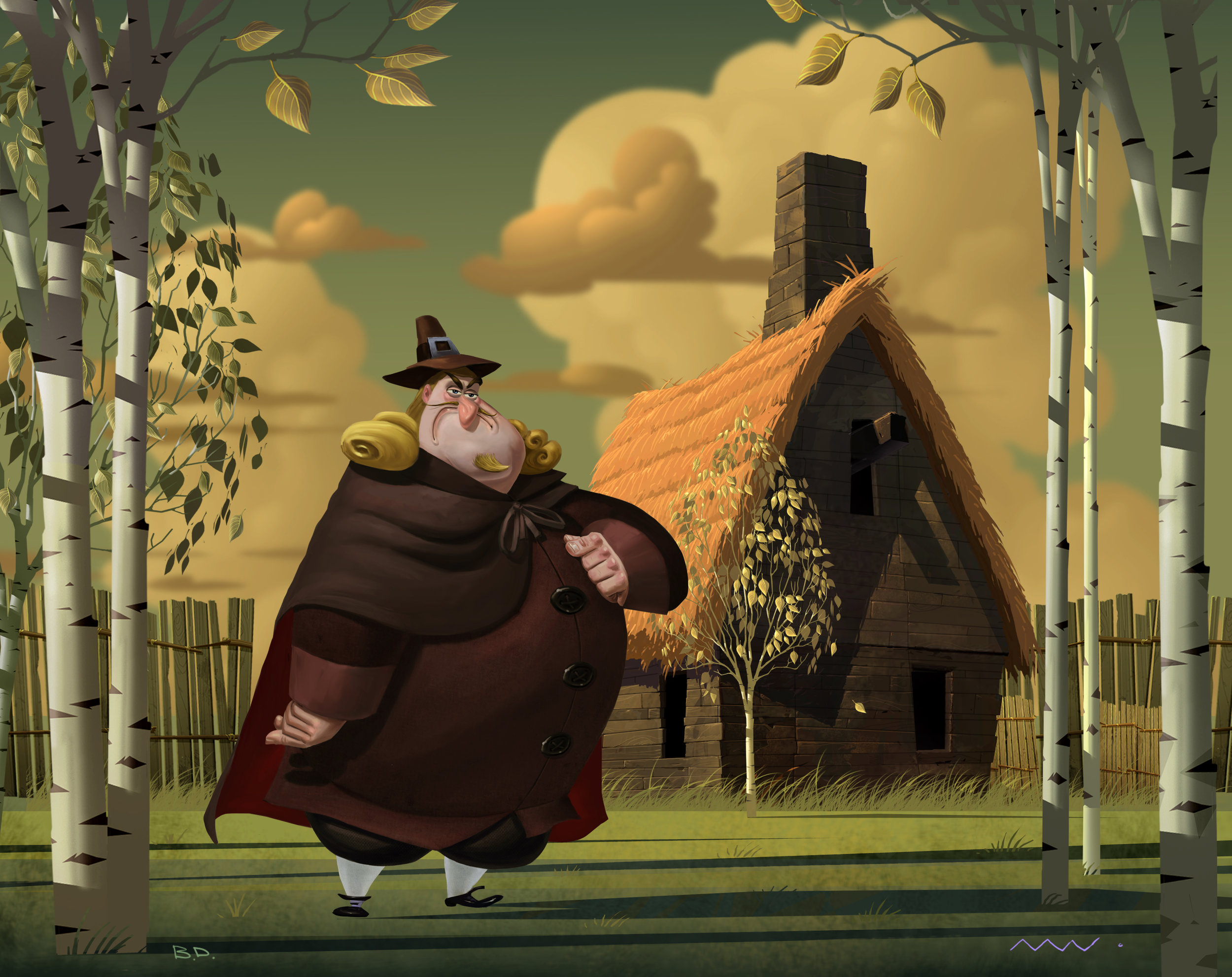
Here's what the film would have looked like. This is a Will Finn designed character that is painted by Bill Dely and composited into the world i was designing. I wanted the 1621 section of the film to have a sepiad cast to it in contrast to the more cool, electric tones of modern day. I particularly loved this character design of Mr. Finns. It kinda reminds me of something that Don Martin would have done.

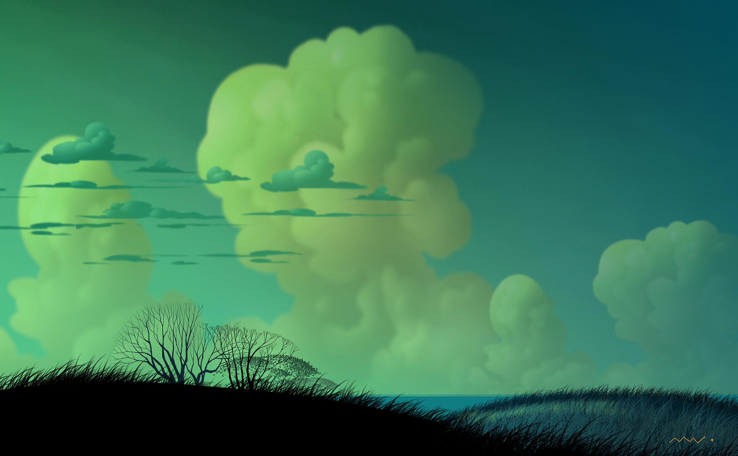
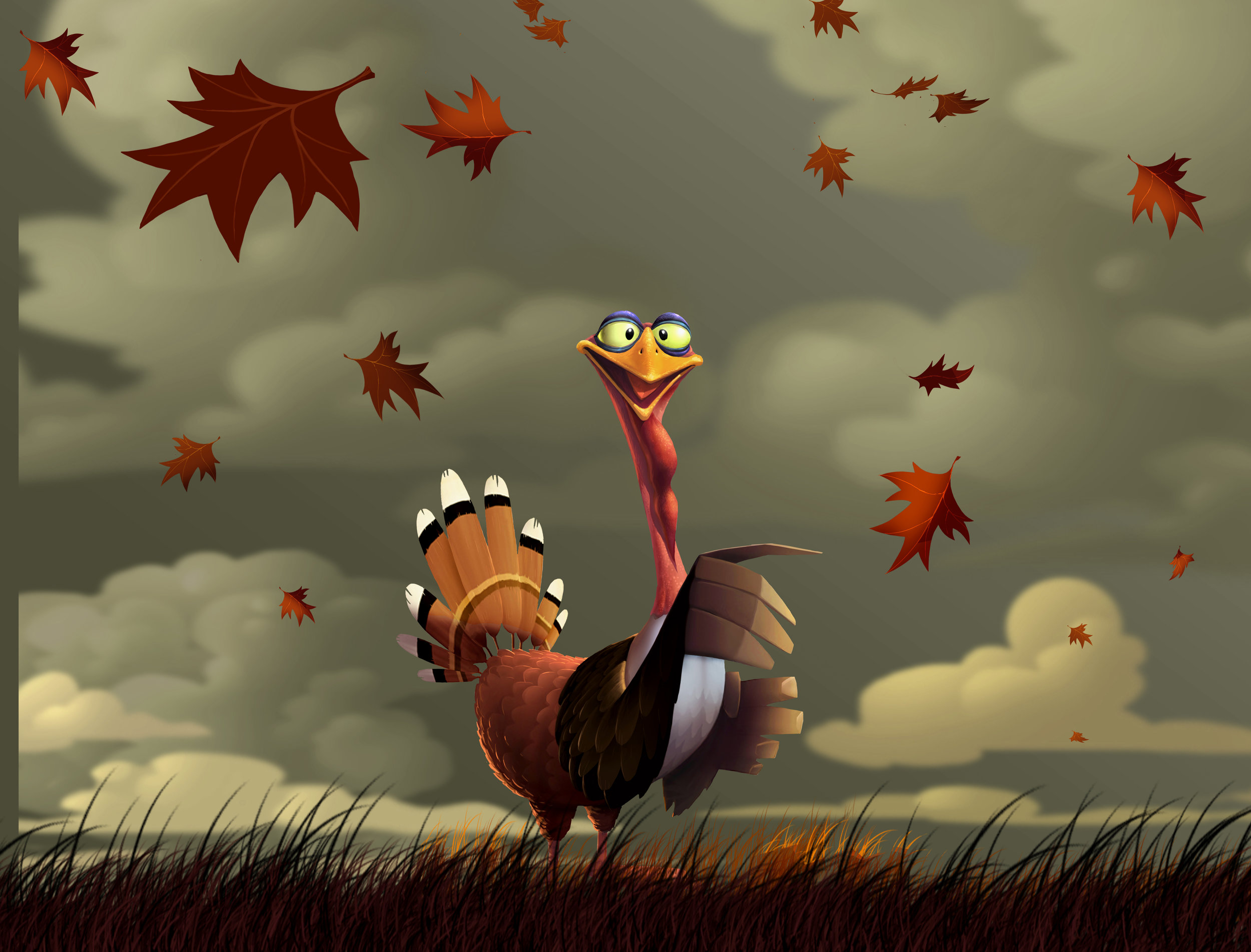
Here's a simple stage i painted. Imagine the clouds drifting, the grass waving and the leaves blowing in stereo. It's just a BG of sky and grass, but if it's pretty it makes a very cost efficient setting for a scene. And i love clouds. Turkey design by Michigan's favorite son Brandon Jeffords.

He's the amount of rendering i thought would have looked nice. Not too much - not too little. And to not look like cg - a bit more like a painting.

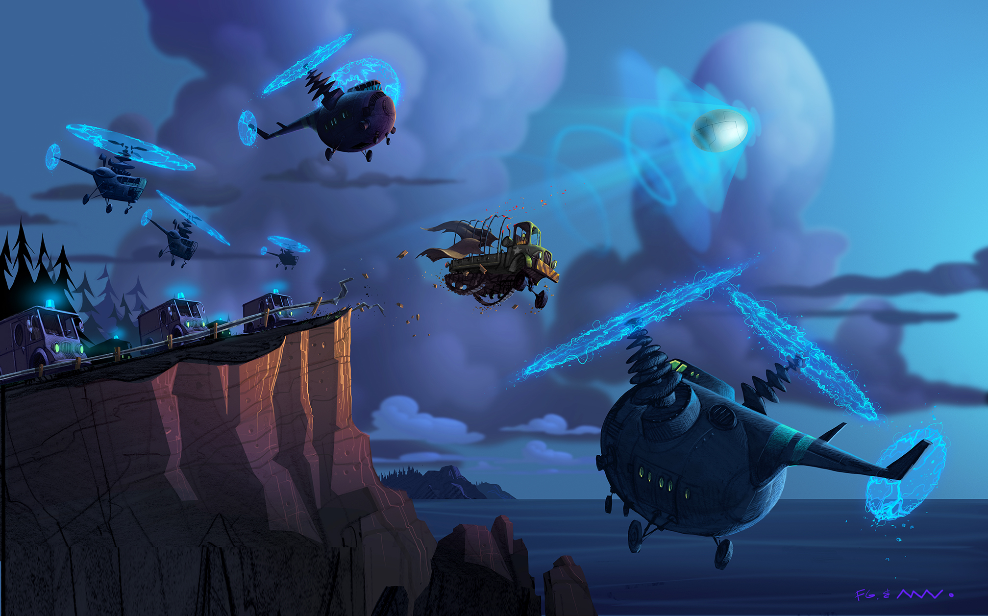
Used to help sell the story. Here the time pod narrowly escapes capture by the military. Not one part of this ended up in the film. Bad-ass vehicle designs by Fred Gardner.

Fred and I came up with dozens of amusing ways for the bird-brains to get lost while trying to navigate the time pod. None of them were in the movie. Including this.

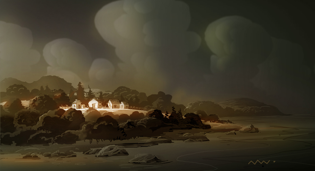
A digital painting where I was experimenting with a kind of flatness that had depth. Something that was graphic but still rich and would separate nicely in stereo. On our research trip the skies in New England often felt heavy and leaden. It was dramatic when the sun broke through bathing everything with gold.

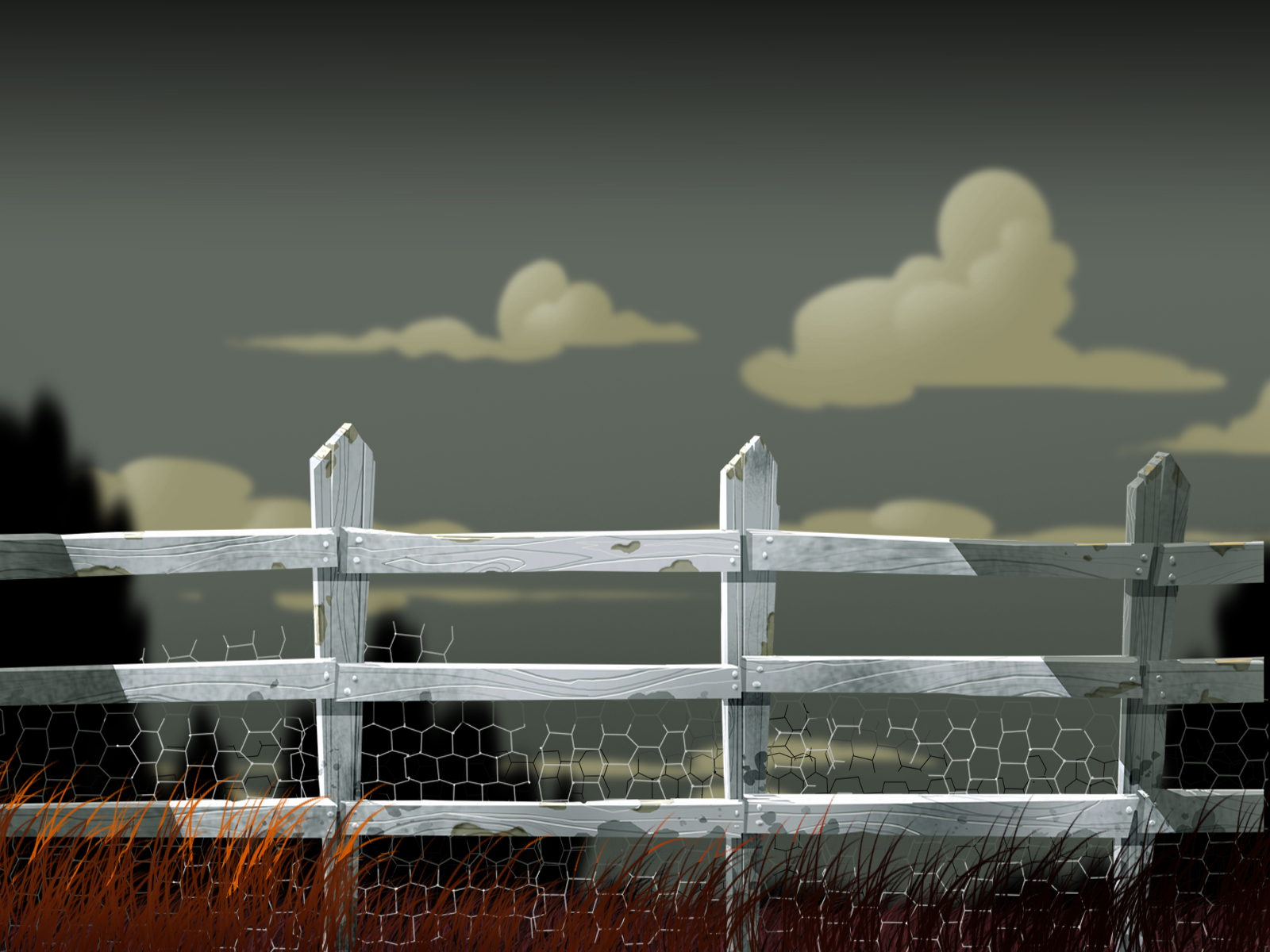
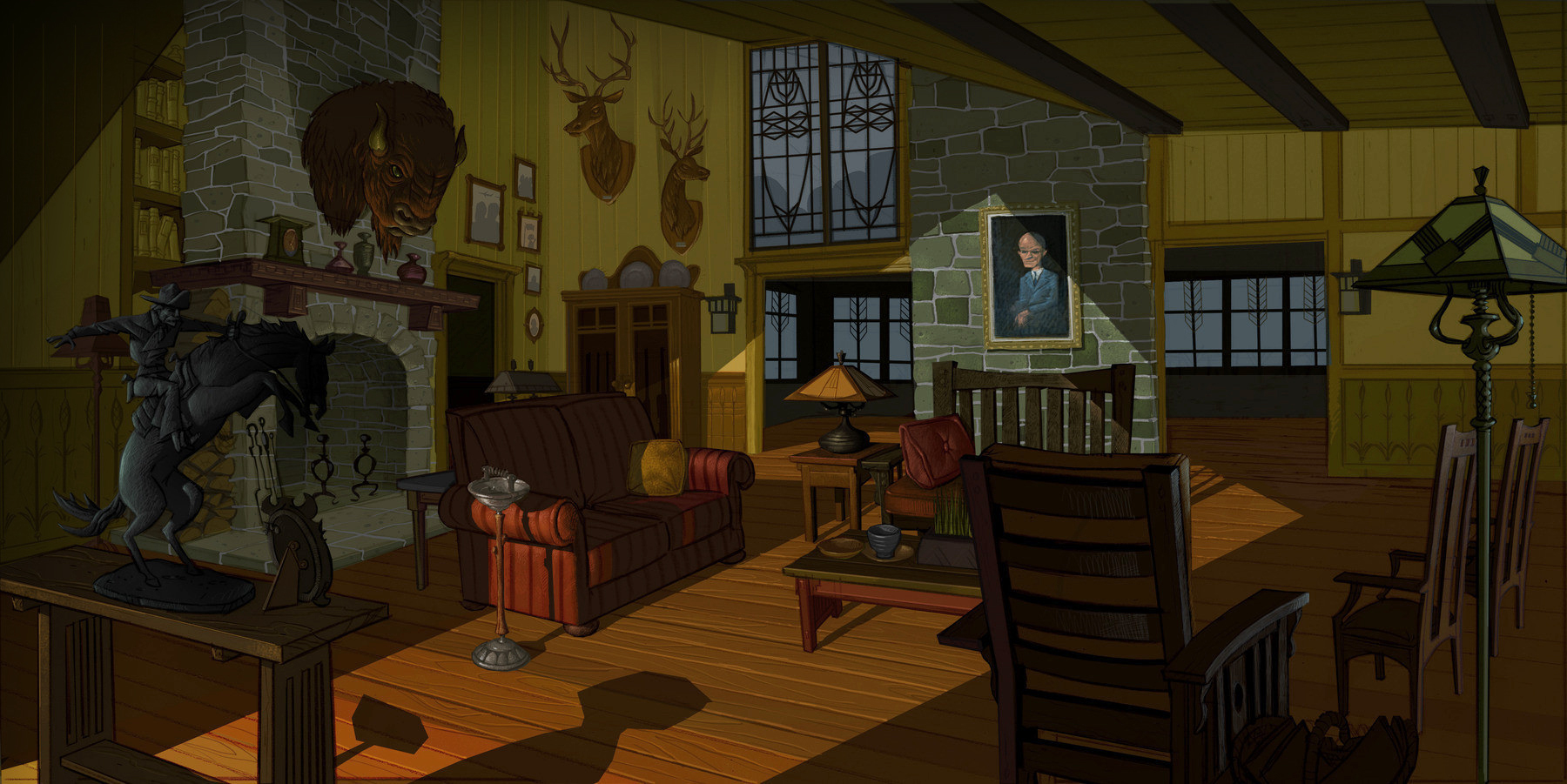
A good background should always feel like there's something missing. Everything in it should set the mood, guide the eye, frame characters and support the actions that take place in a given scene.
This would make a nice mural for my sons wall.

Seeing what I could get away with. Actors call it 'giving them a range'. In the beginning i remember trying to design paintings that were eye catching, regardless if it was the final style for the film. You want people intrigued by whats taking shape- even if your skies are green.

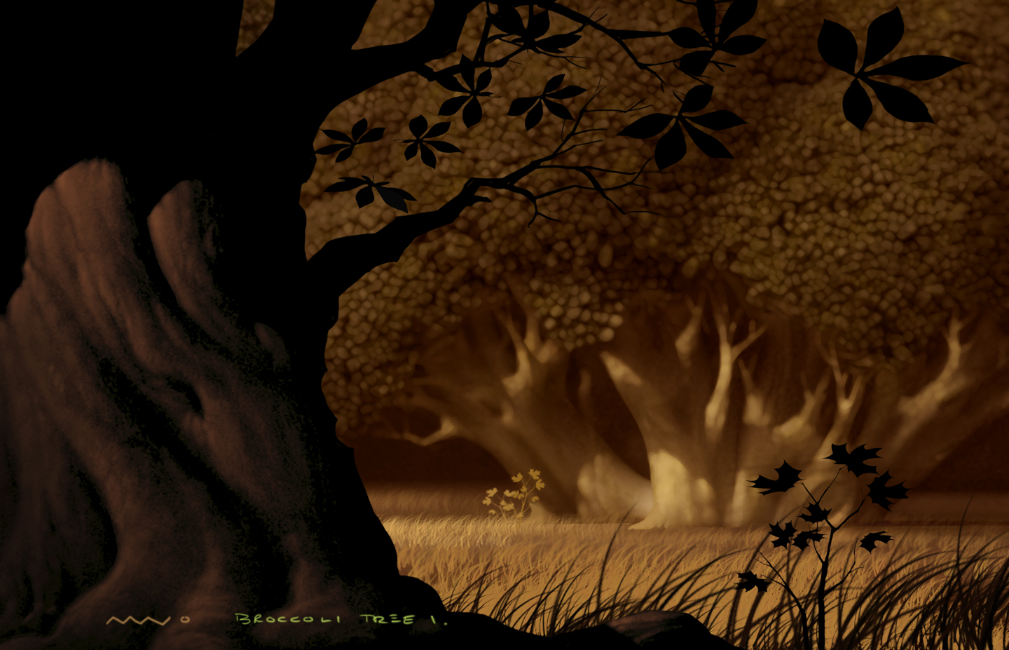
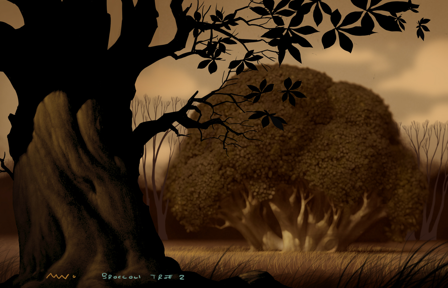
Yup. In an experiment to resolve how 3D trees may look at a distance I took some photos of broccoli and shopped them into some of my environments.

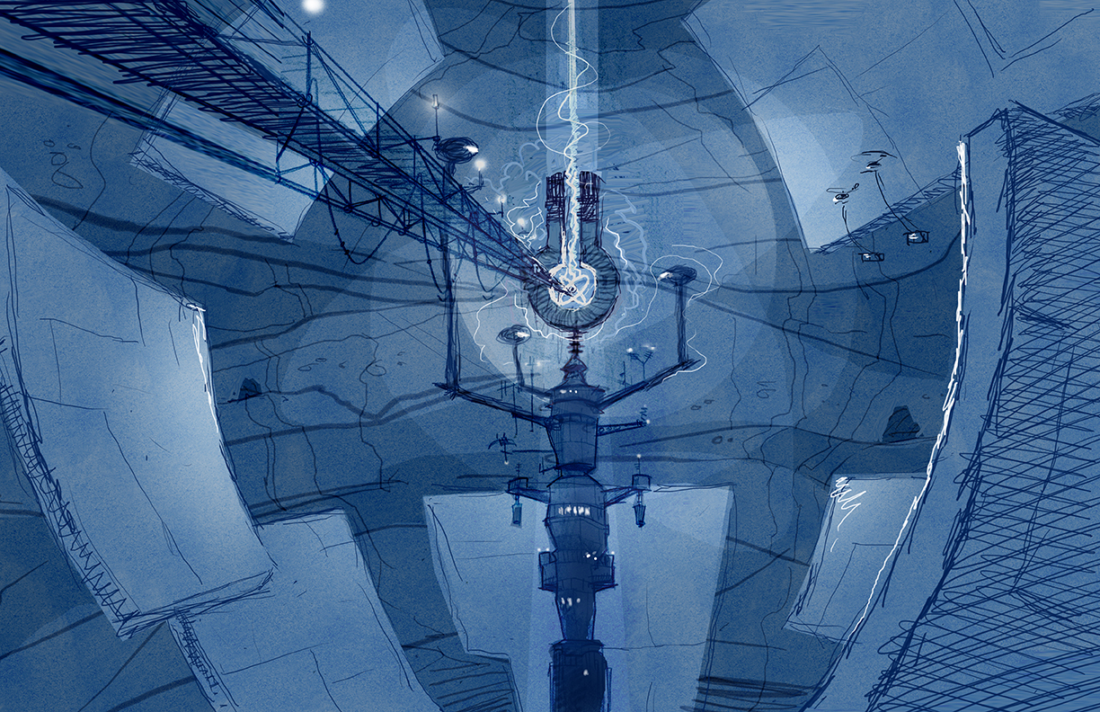
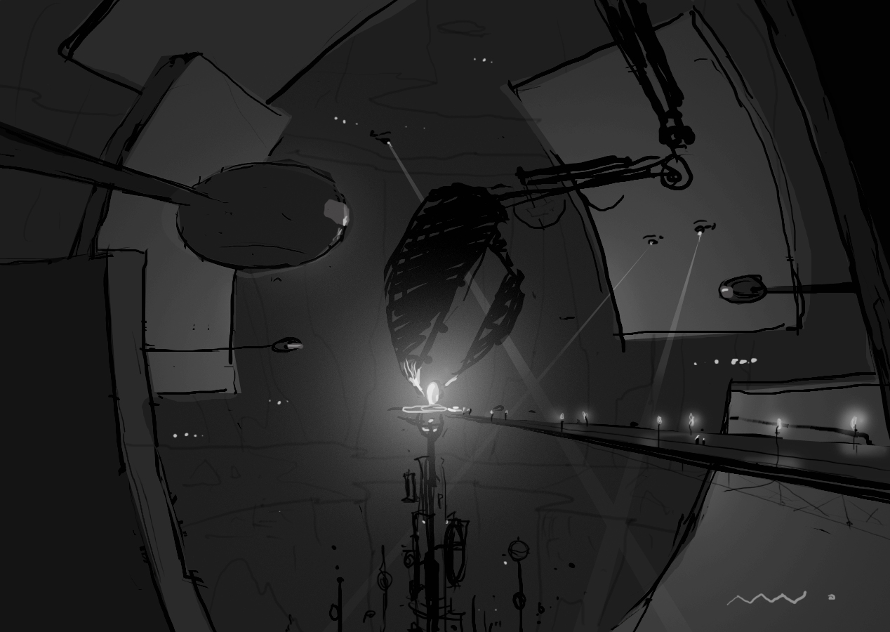
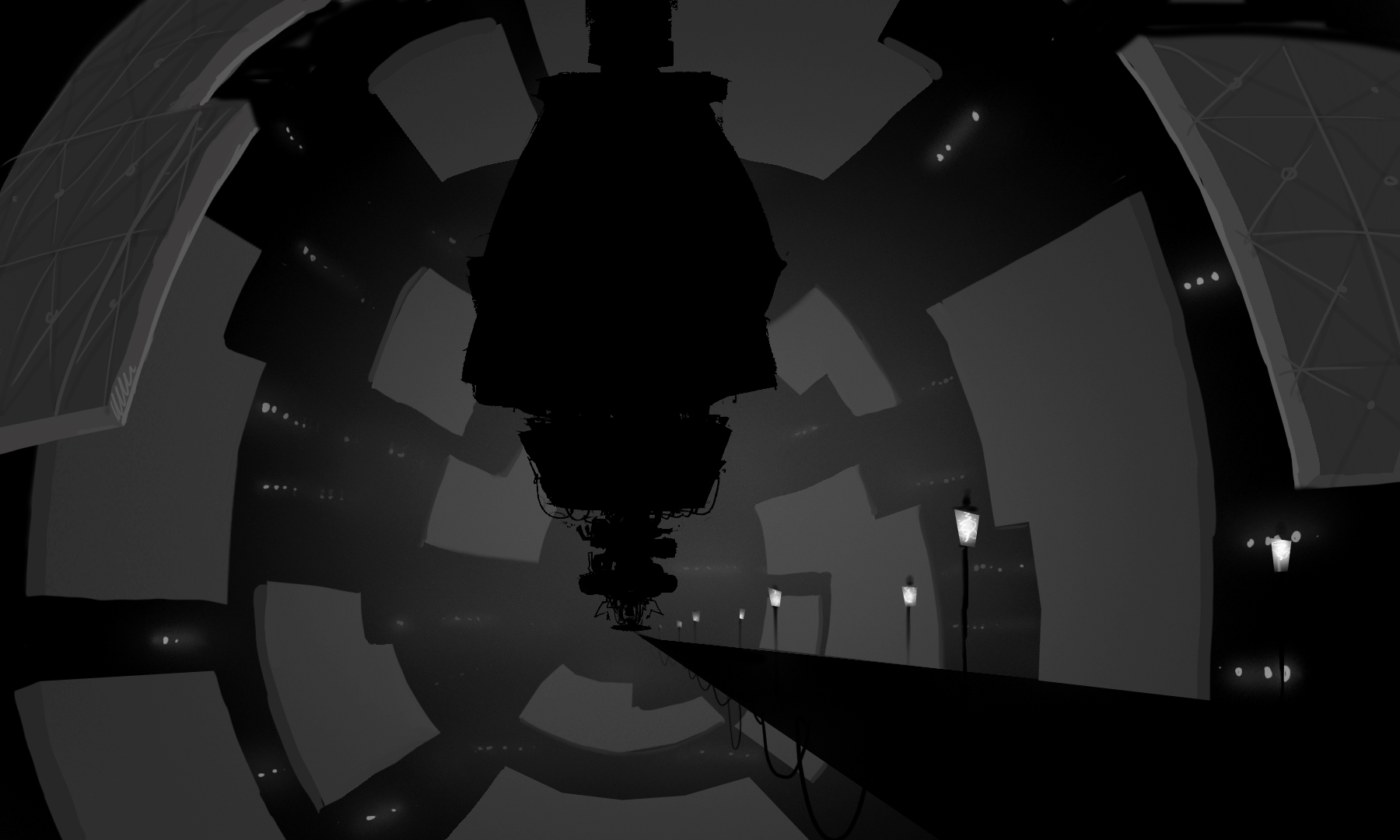
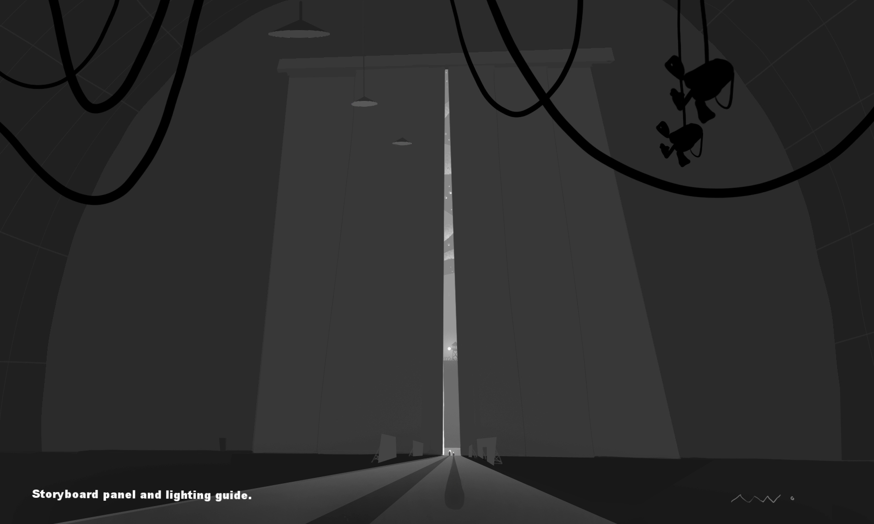
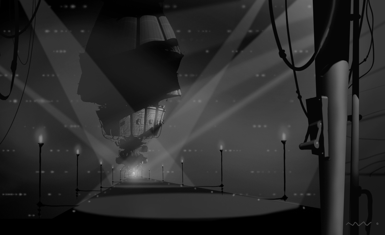
The amazing Yashar of Iran took the color and lighting guides and painted this groovy Fred Gardner layout of the massive time travel launch engine. I'm pretty sure my golf clubs are in there somewhere. This was used as reference for a look test and teaser trailer kind of thing. The tiny observation windows in the distance were both to establish scale and to suggest the presence of stars.

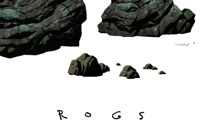
Paintings as examples for the amount of surface and texture detail i was looking for.

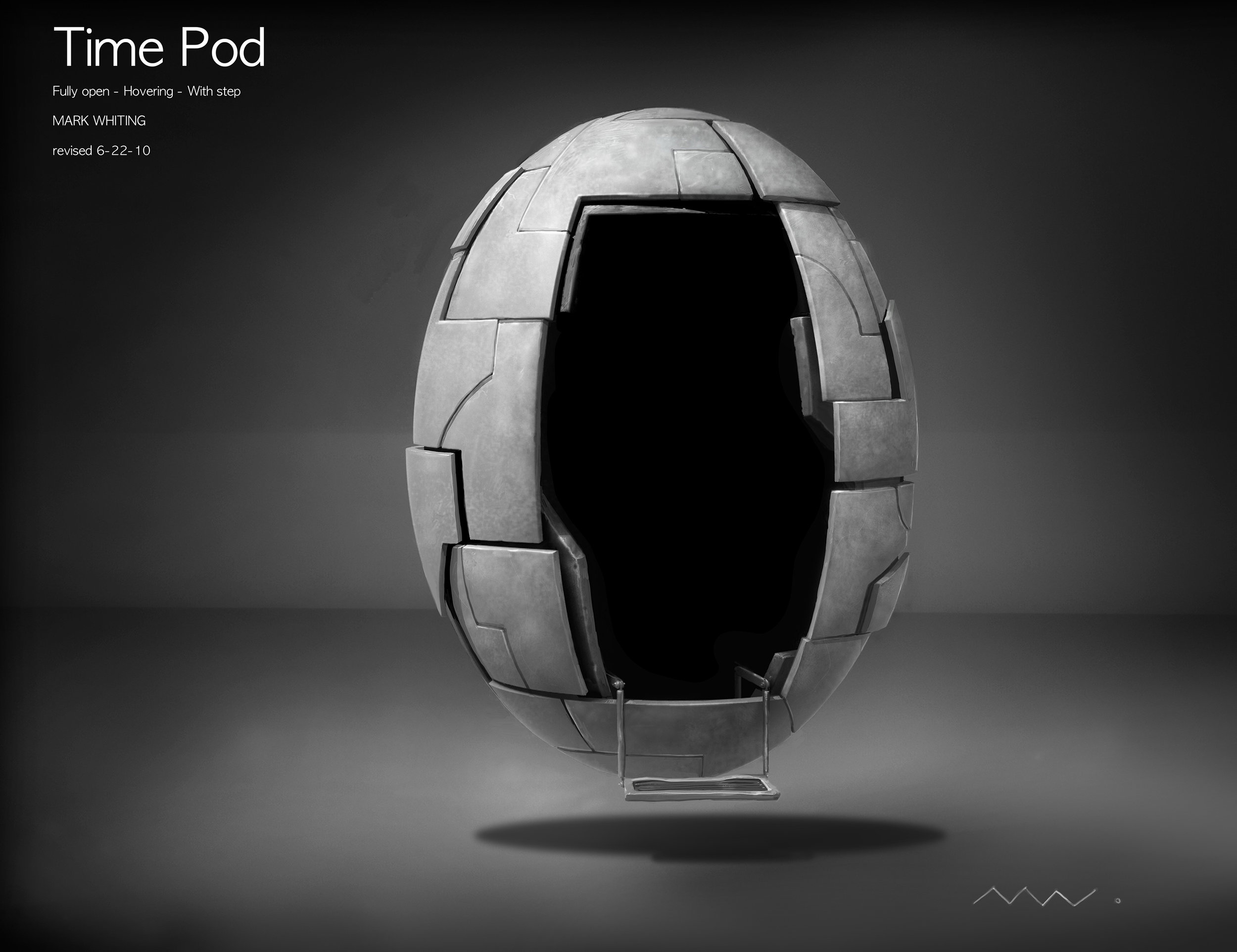
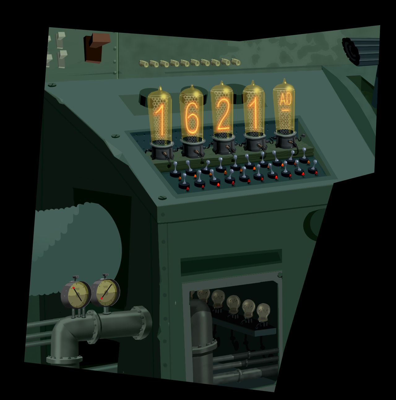
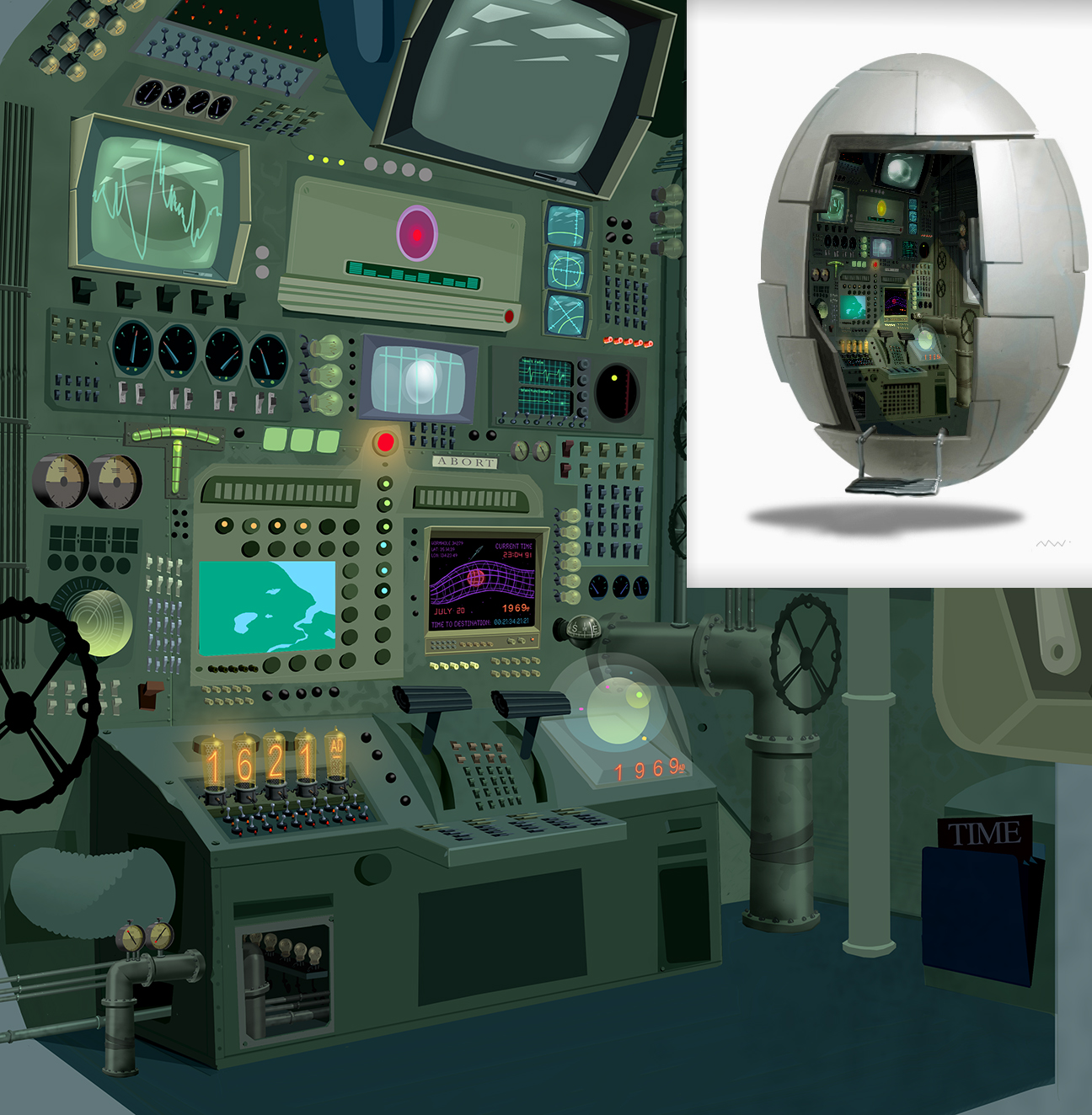
He'res what i was thinking. Part alien UFO back-engineered technology and part RV. Of course this was a bird movie so it had to be shaped like an egg. Sometimes the lowest hanging fruit is the sweetest.

Here is the way i designed the time pod to behave - with alien-like, anti-gravity technologies that rubix protective leaden panels to allow entrance. and allow the pod to animate and behave as a character of its own. Like a floating eye - the opening its pupil.

A painting i was doing of a Fred Gardner layout. Too often during production a scene will get cut and you have to leave something half-baked by side of the road. This painting was one of them.
