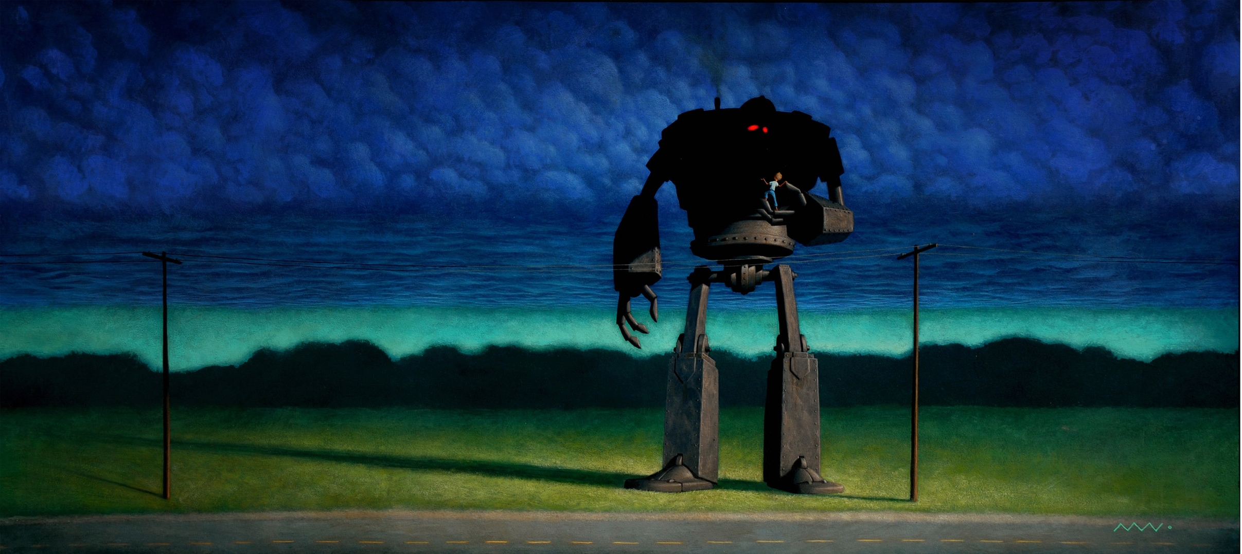
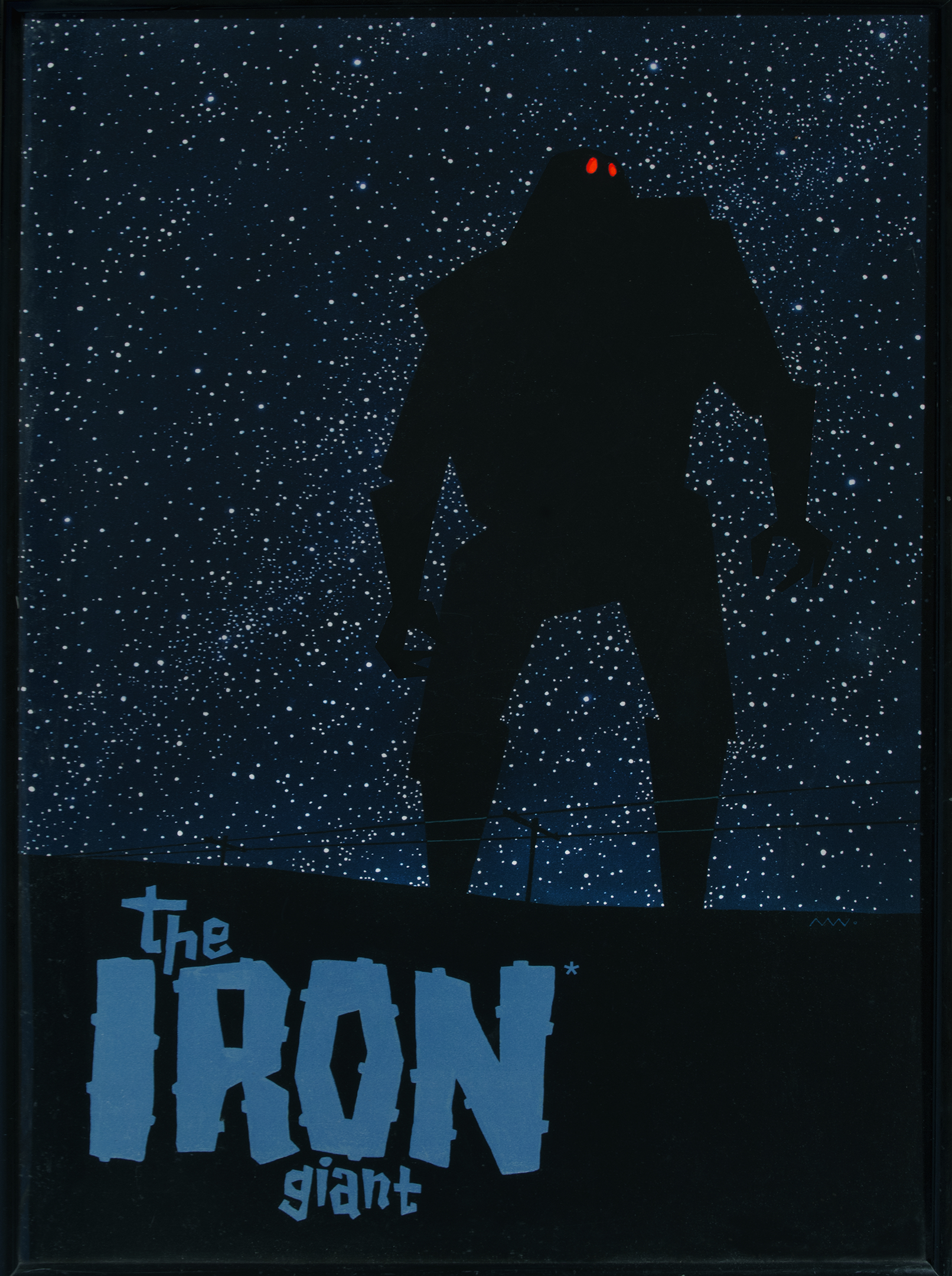

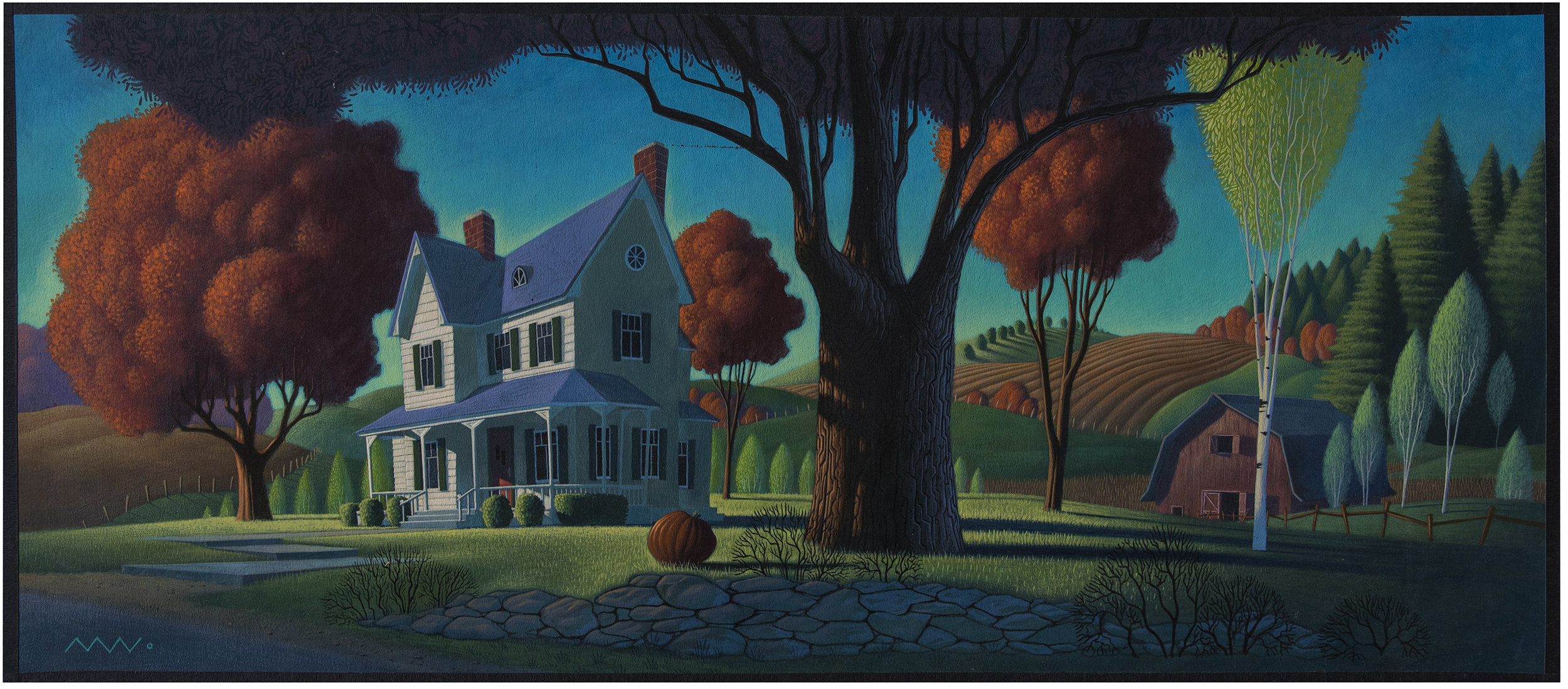
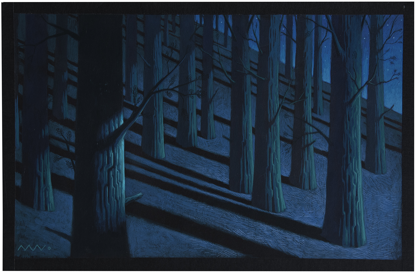
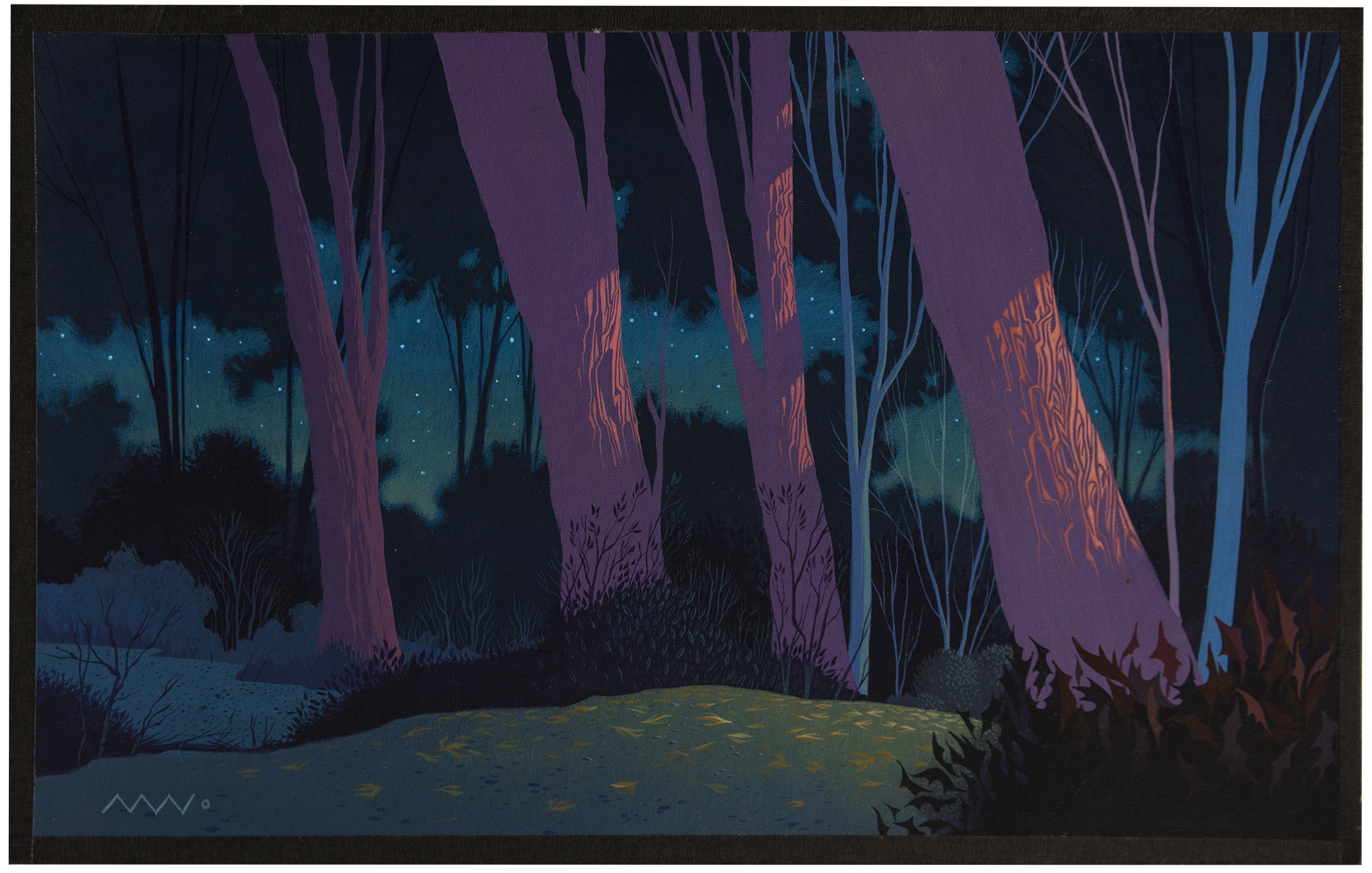

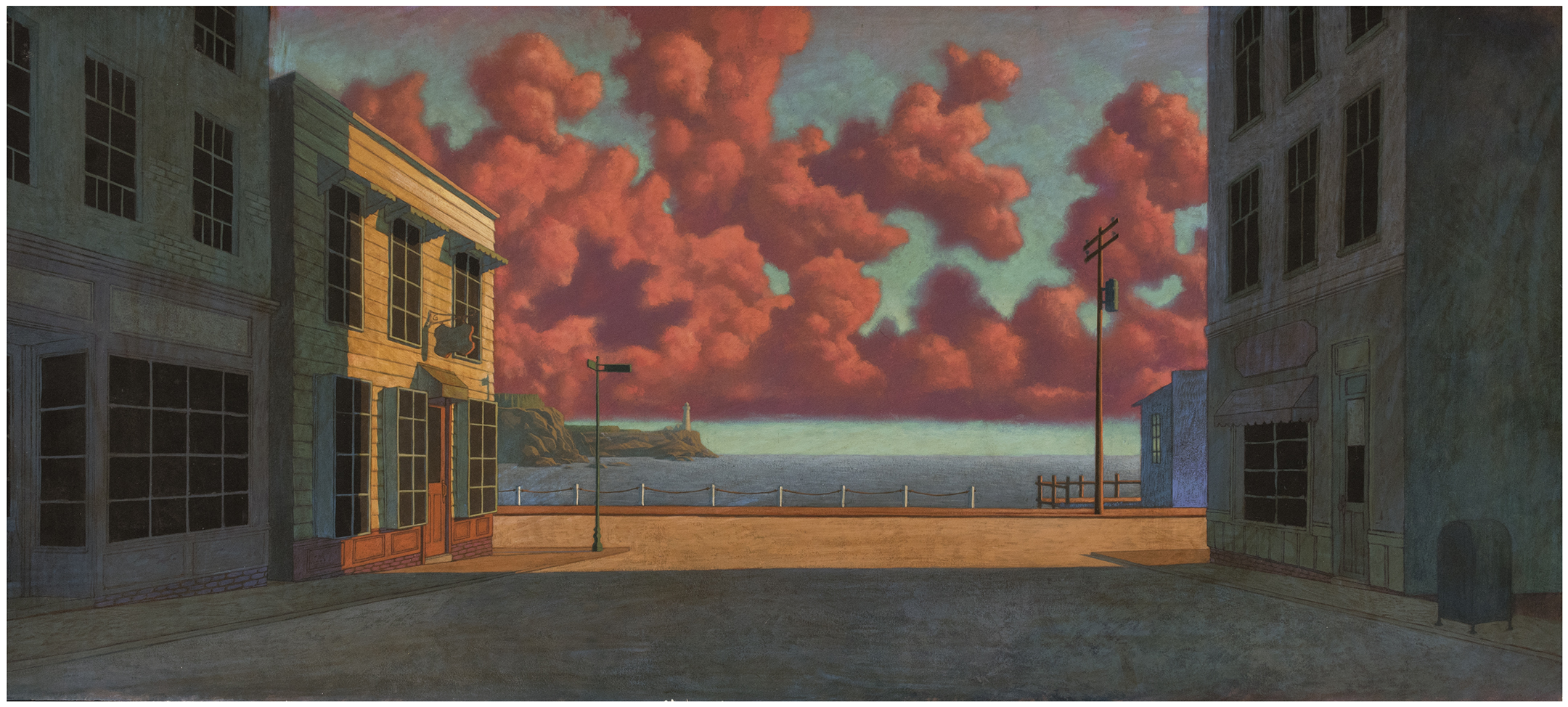
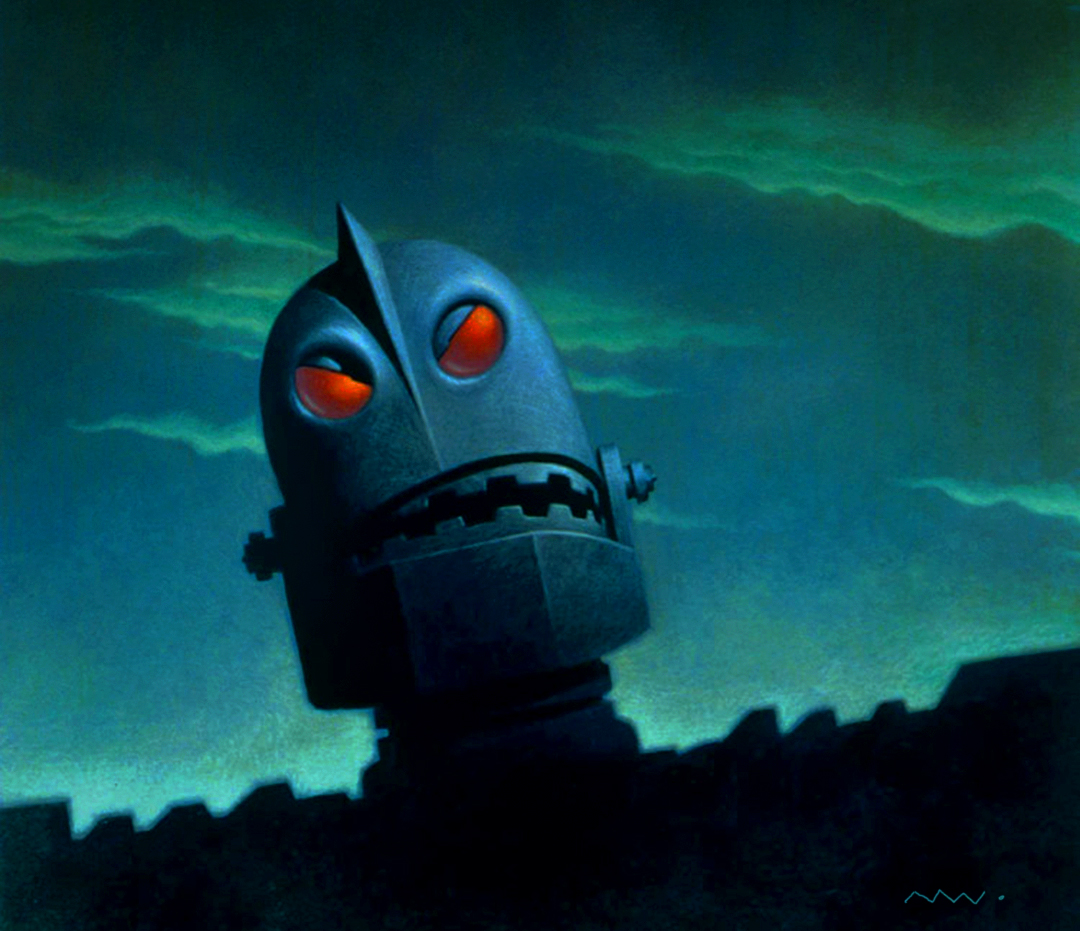






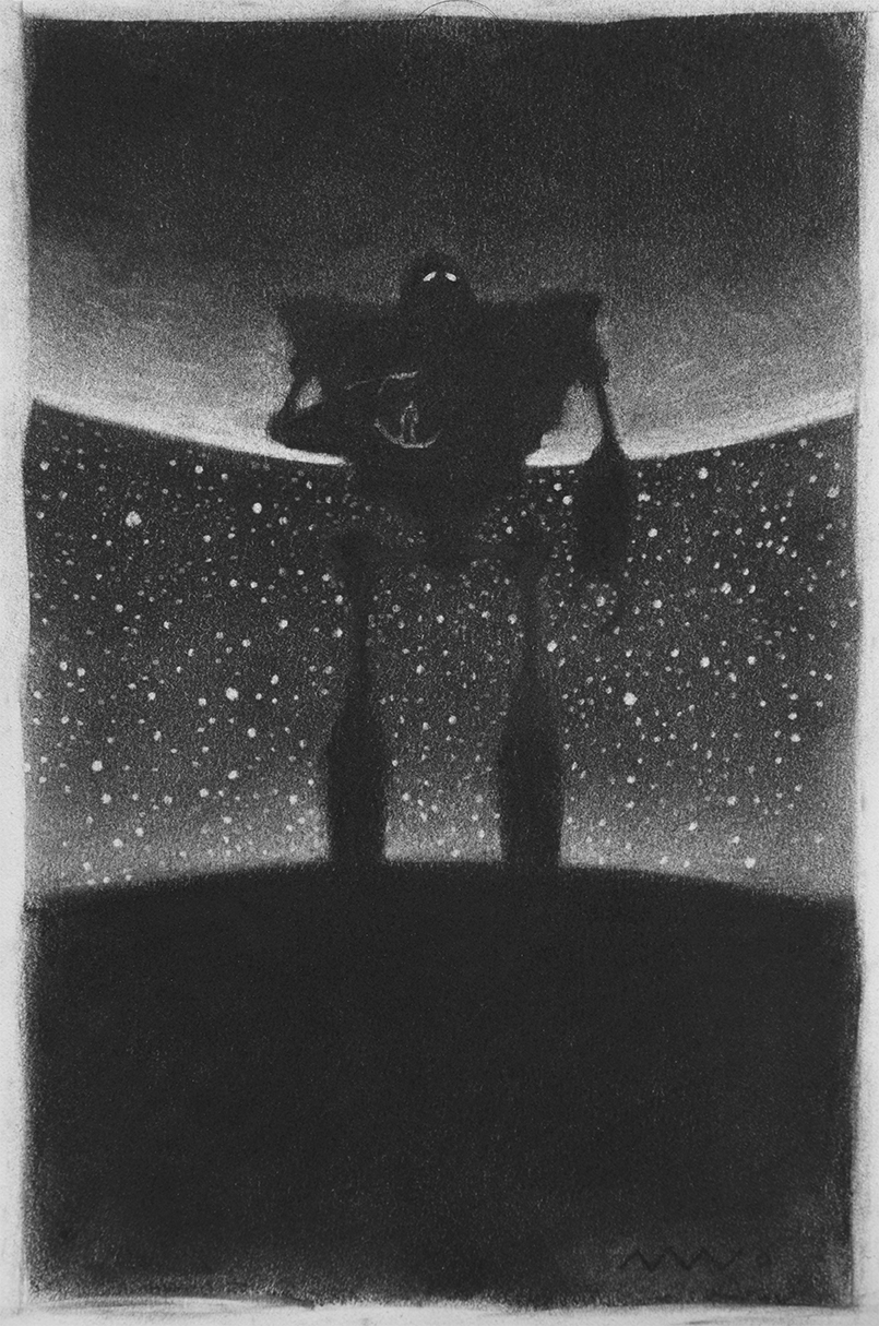
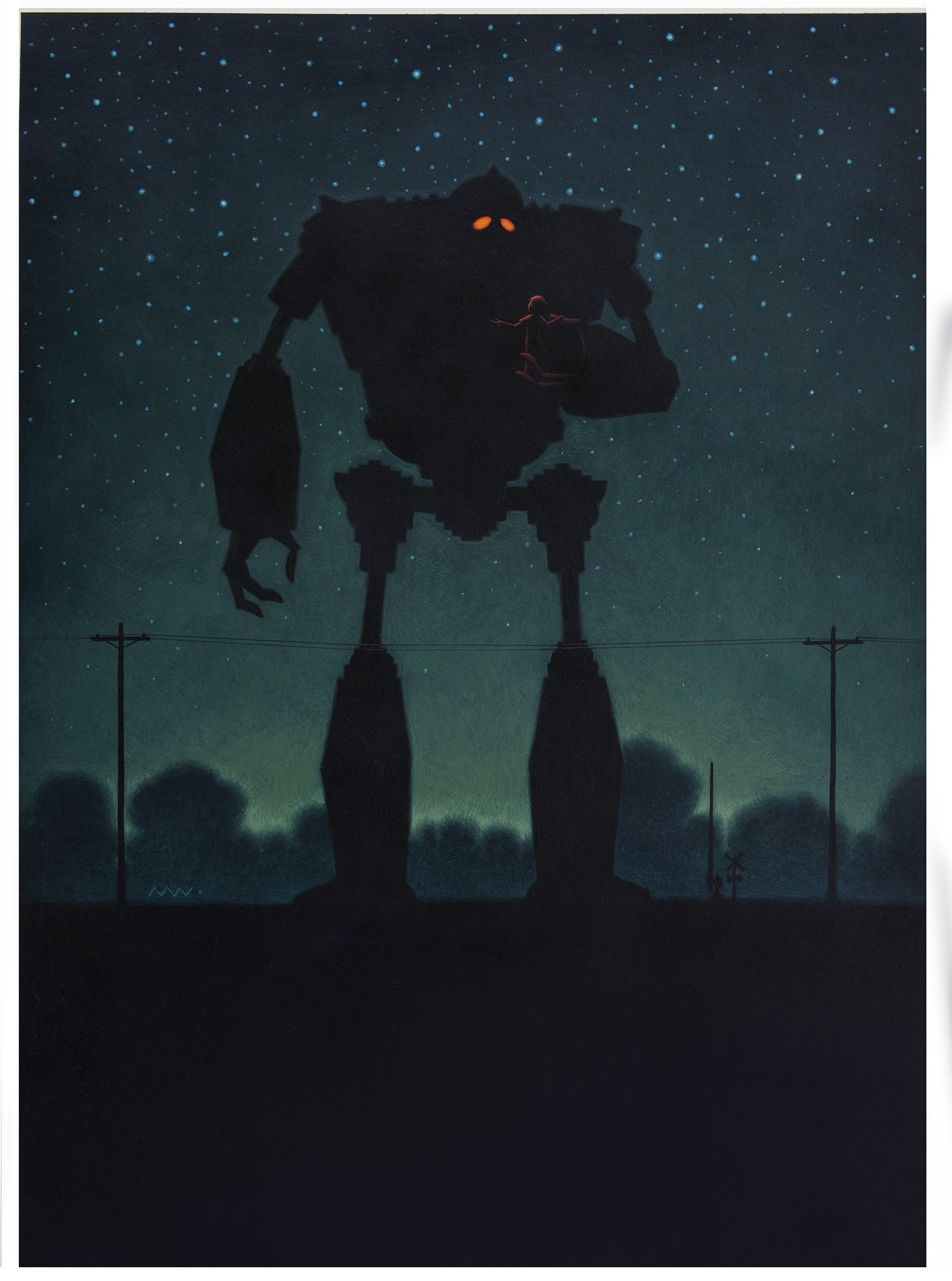



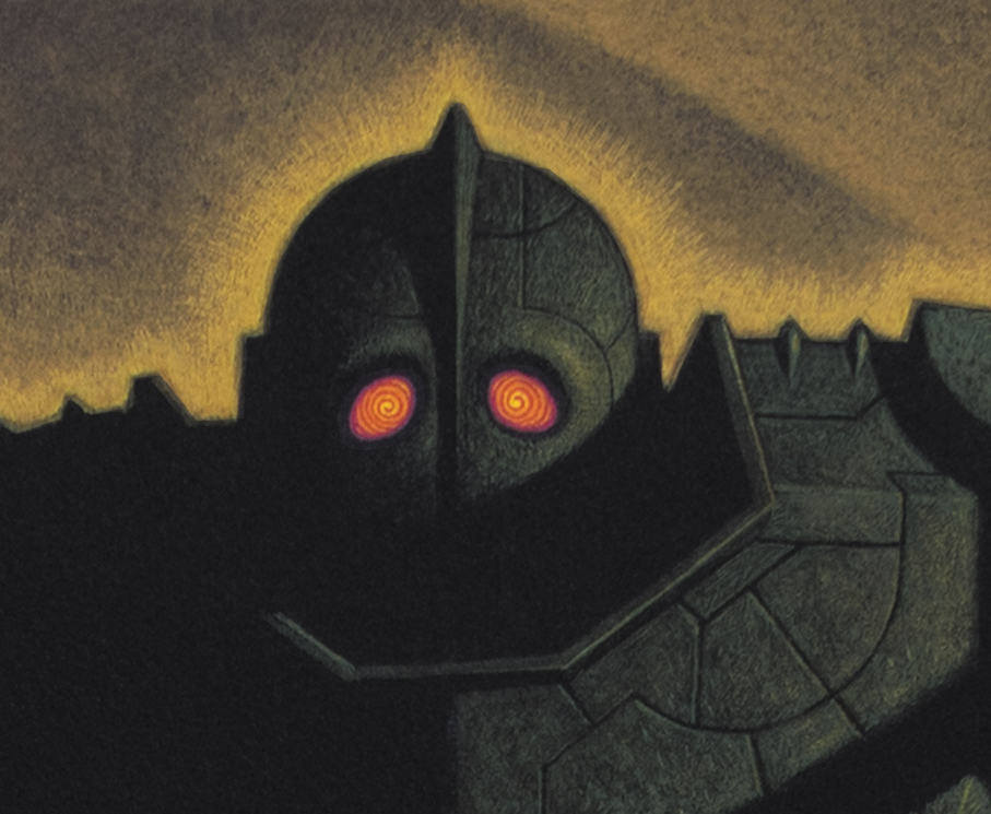

Acrylic on board. 18' x 40"
Bird took this into an early meeting with the brass at WB and said it went a long way toward helping sell the relationship between the boy and the bot.
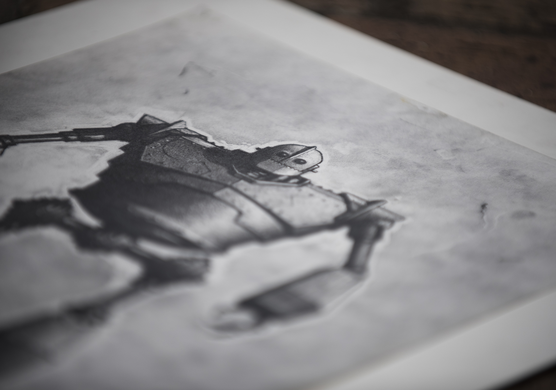
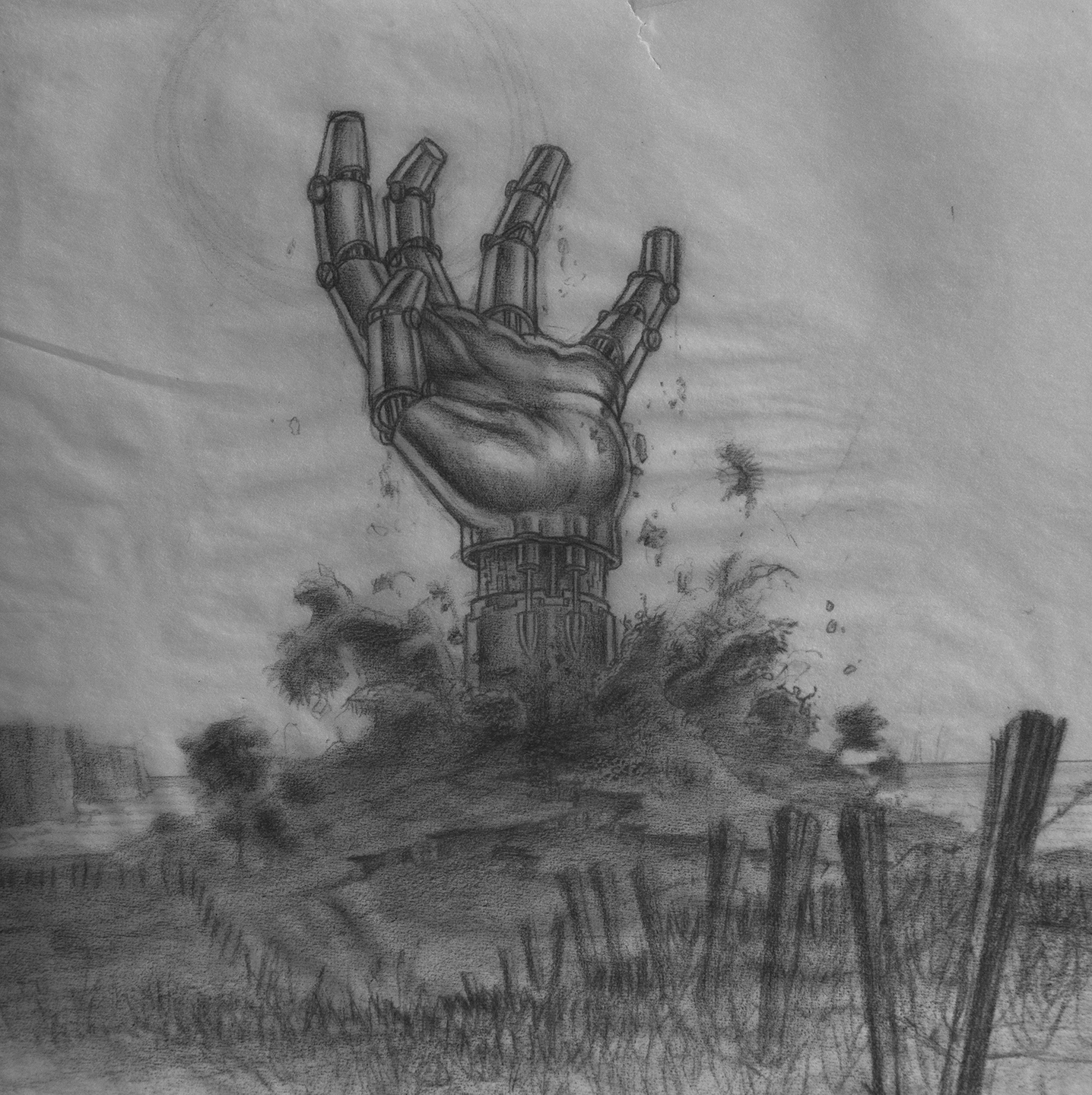
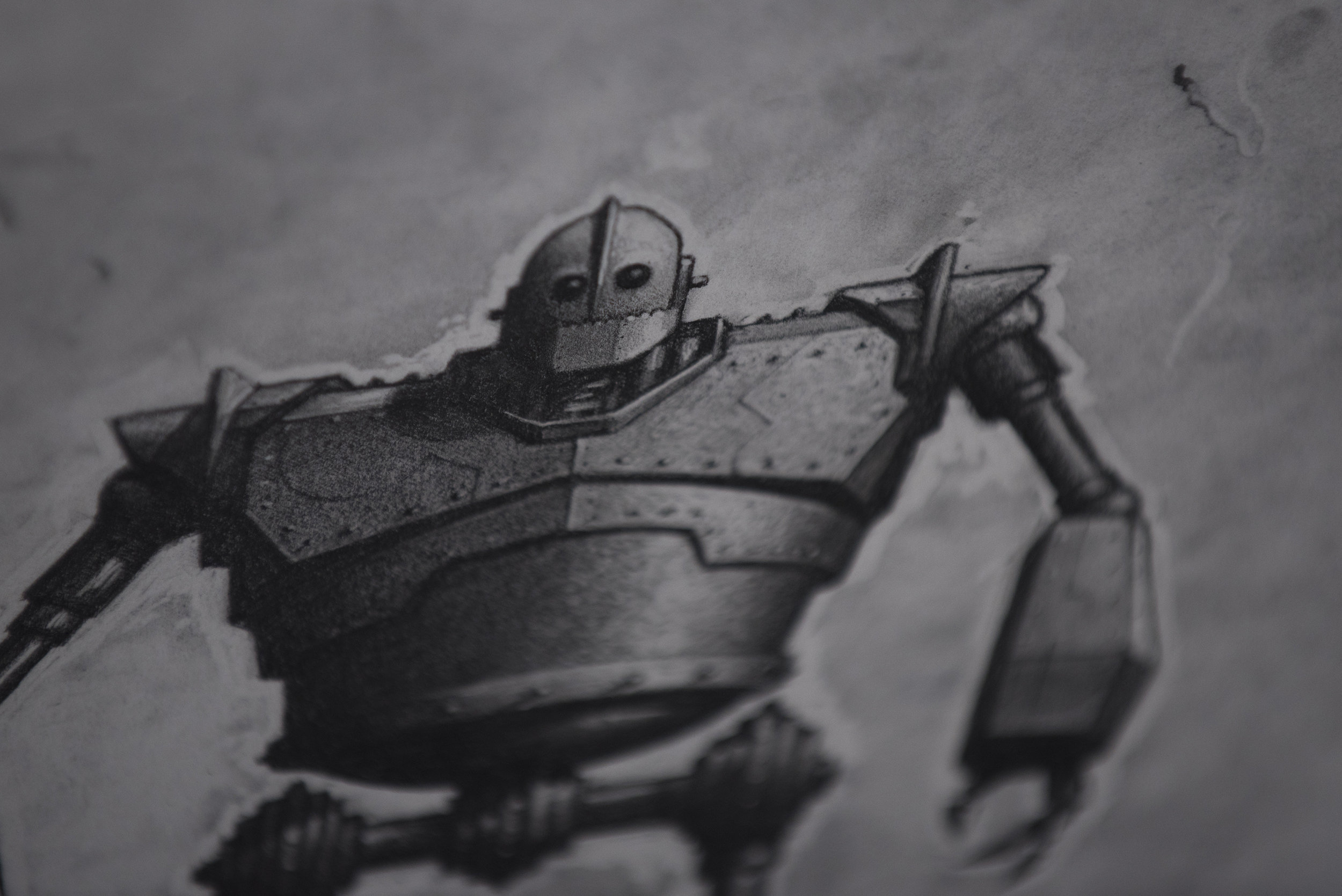
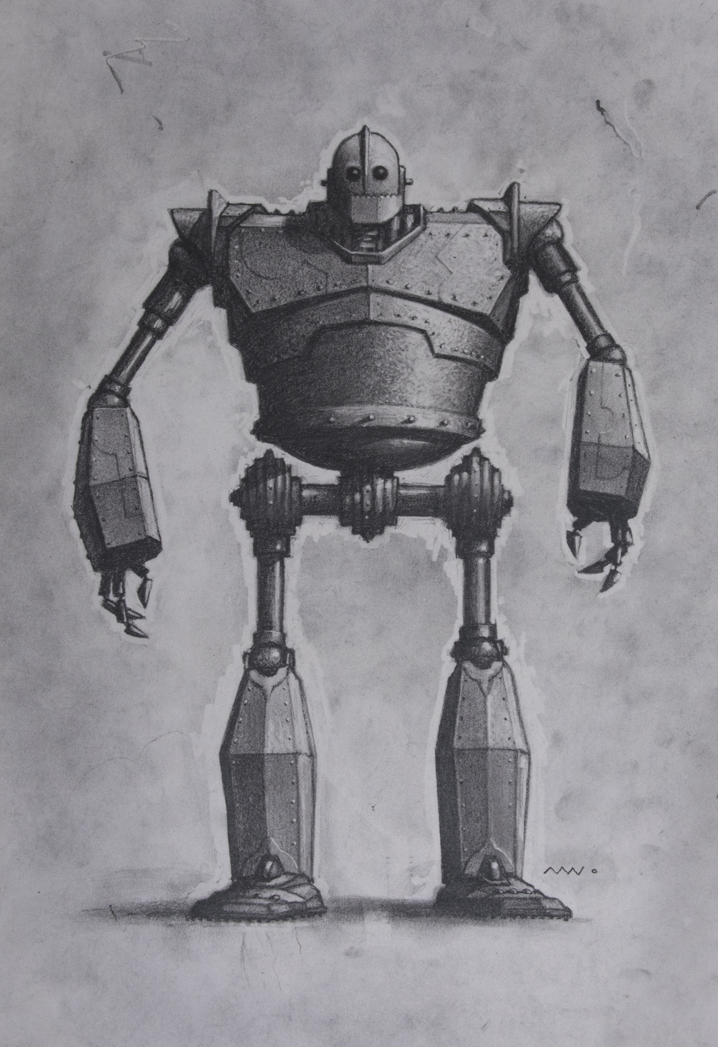
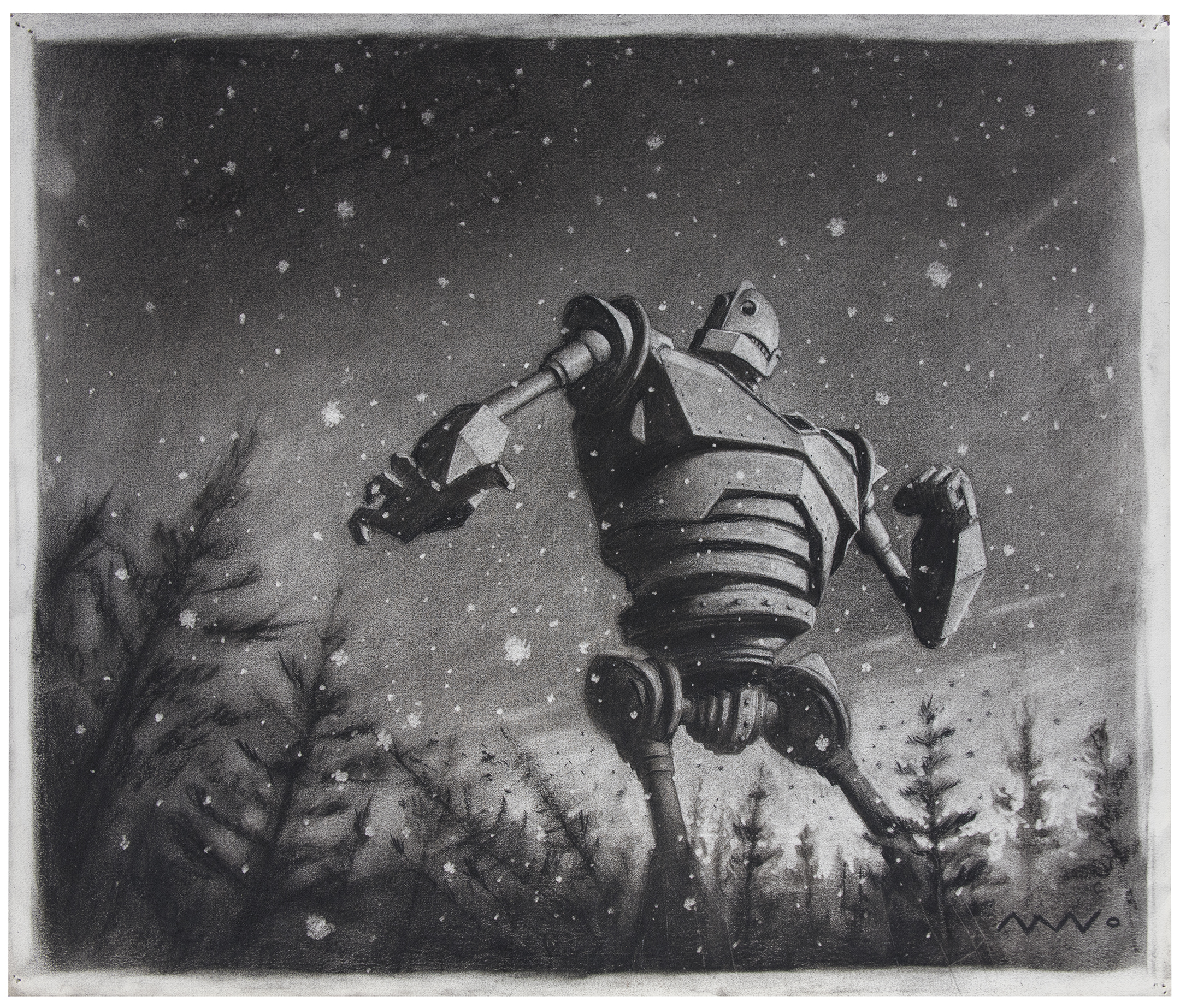
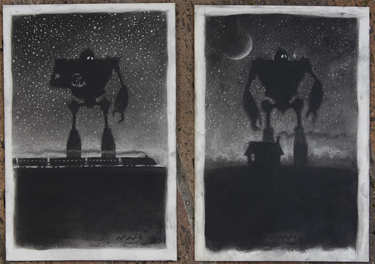
At this point in the robots development I was trying to keep him hulking, ape-like and built like a locomotive. I loved what Joe Johnson was doing - everything was kinda tubular, the proportions human, even Rocketeerish. I wanted the giant to look as heavy as his name. I was all about the Iron, the box, the barrel and the bolts. Stealthy angles and a battleship armor. I even tried rusting him and giving him a smoke stack. He was an IRON giant after all so pretty much all my designs went toward pushing for something boxy, bolted and impossibly heavy. Something that would leave craters with every step. A massive, mechanical death machine... with a heart.
I thought of the GIANT as a Frankenstein type of character- a misunderstood monster that you were horrified by at first sight but grew to love. King Kong, Hunchback, Phantom, etc. You cant go wrong with the classics.

ANNIE AWARD nomination for OUTSTANDING PRODUCTION DESIGN in an animated feature.

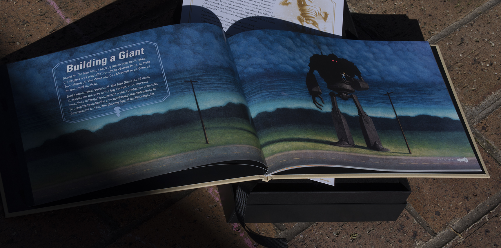
About two years before Warner Bros (where I was Art Directing) and Turner (where Brad Bird was developing his noir detective film, Ray Gunn) merged, there was a short period of development on a book written by Ted Hughes called the Iron Man. The rights to the book had been obtained by none other than Pete Townshend of The Who and his producing Partner Des Mcanuff who both came in and pitched to about 7 or 8 of us in the development department their ideas. And they had plenty. In fact since obtaining the rights Towshend and co. had already turned the iron man into an album, a music video AND a rock opera.
The highlight of this period for me was an all-day meeting with Pete Townshend and taking Marlboro beaks with him downstairs. I actually felt like somebody there for a minute.

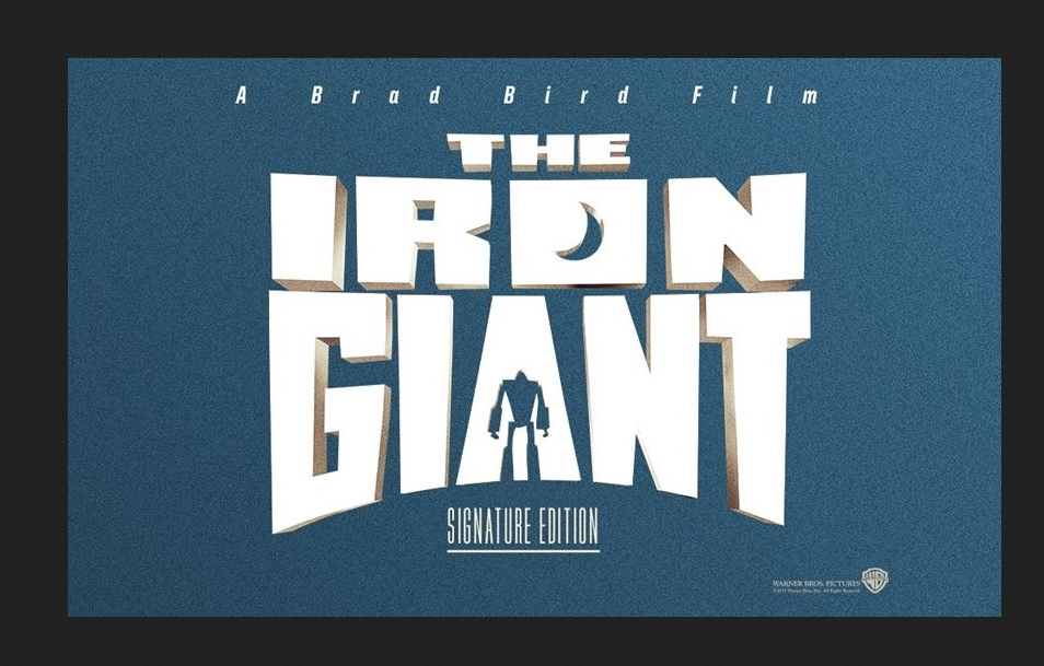
everything was hand done. even the title card i did for our production design board. oh to have had photoshop back then.

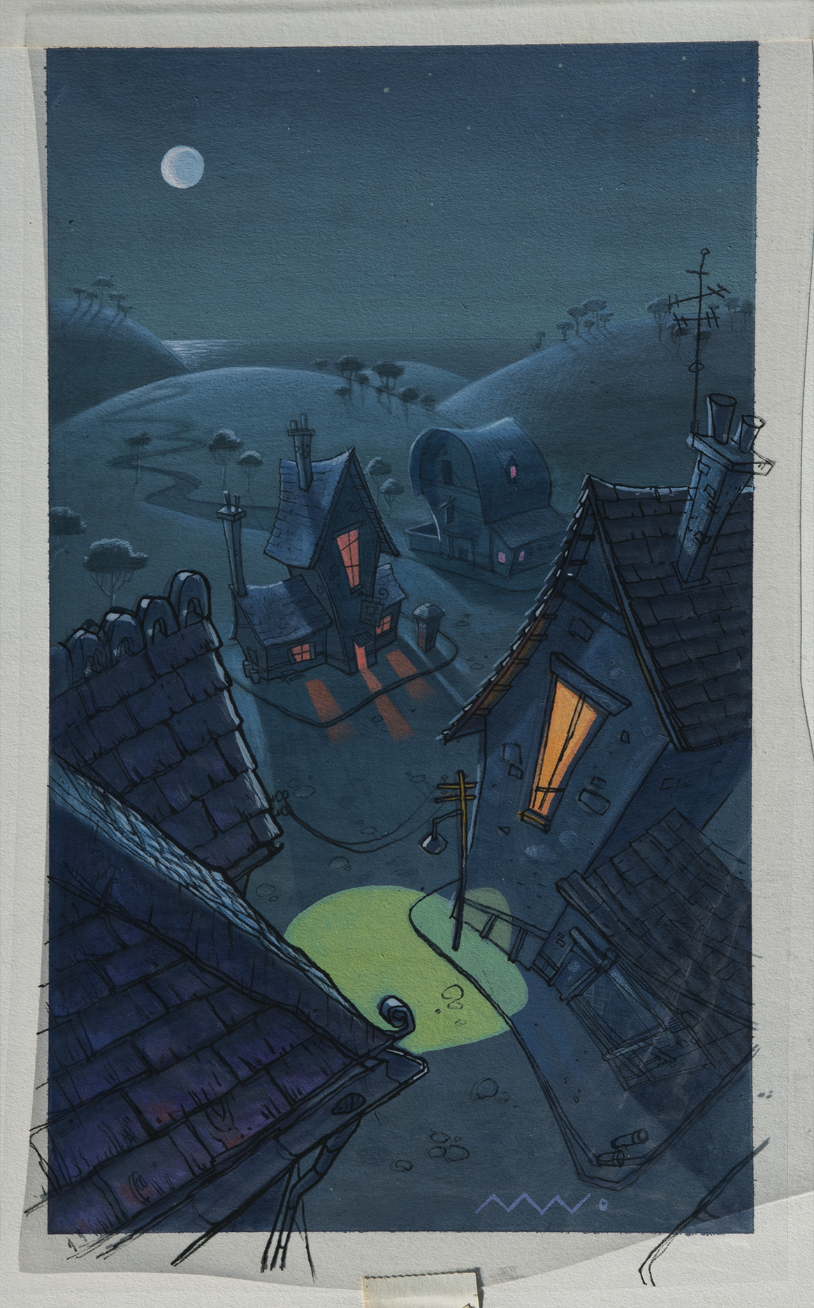
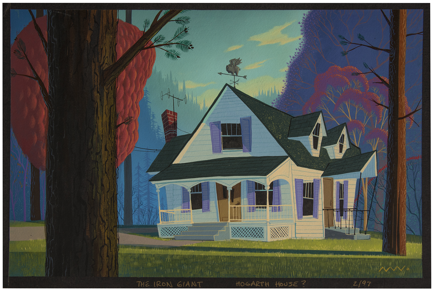
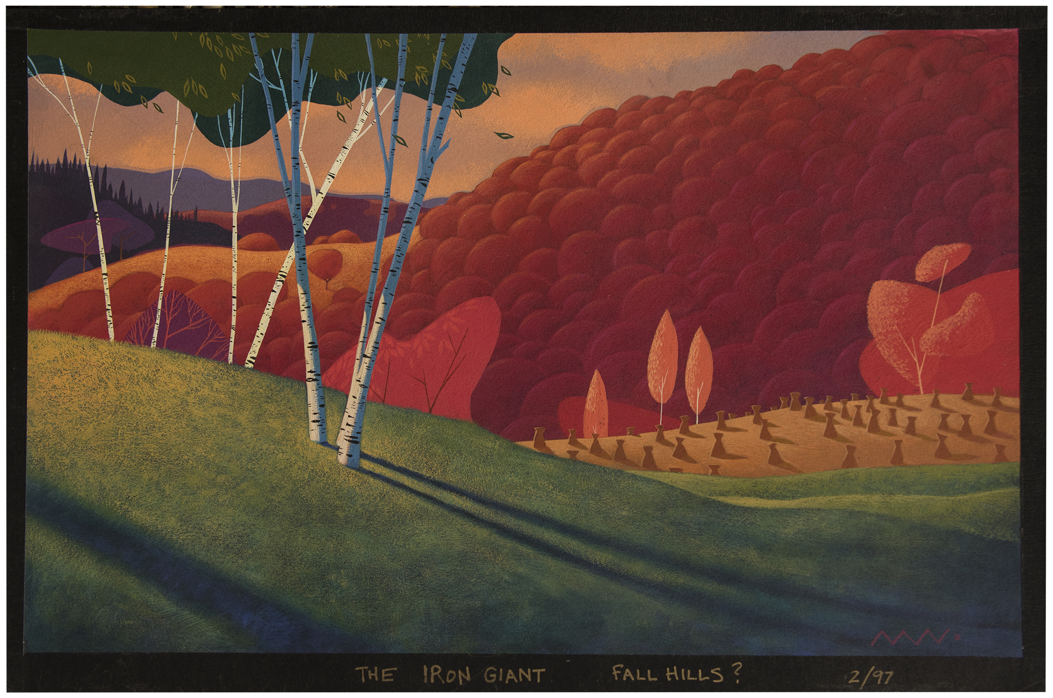
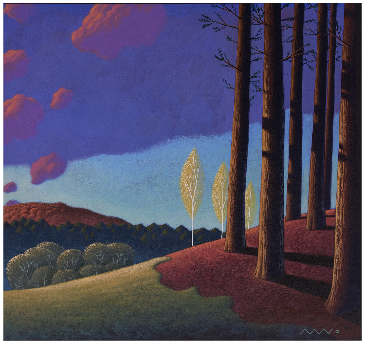
trying different stuff before Bird reined my dumb ass back to reality. hogarts house. cel paint of course. these are maybe 12" wide.

After a couple back and forths with the great Joe Johnson we had the giant almost compete. here's the design we all agreed was our guy - at least most of him. I blew this drawing up HUGE on presentation wall so it was impossible to ignore. i made some tweeks to this design (cut and pasted kind of stuff) had it framed in a metal and presented it to Brad at the wrap party.

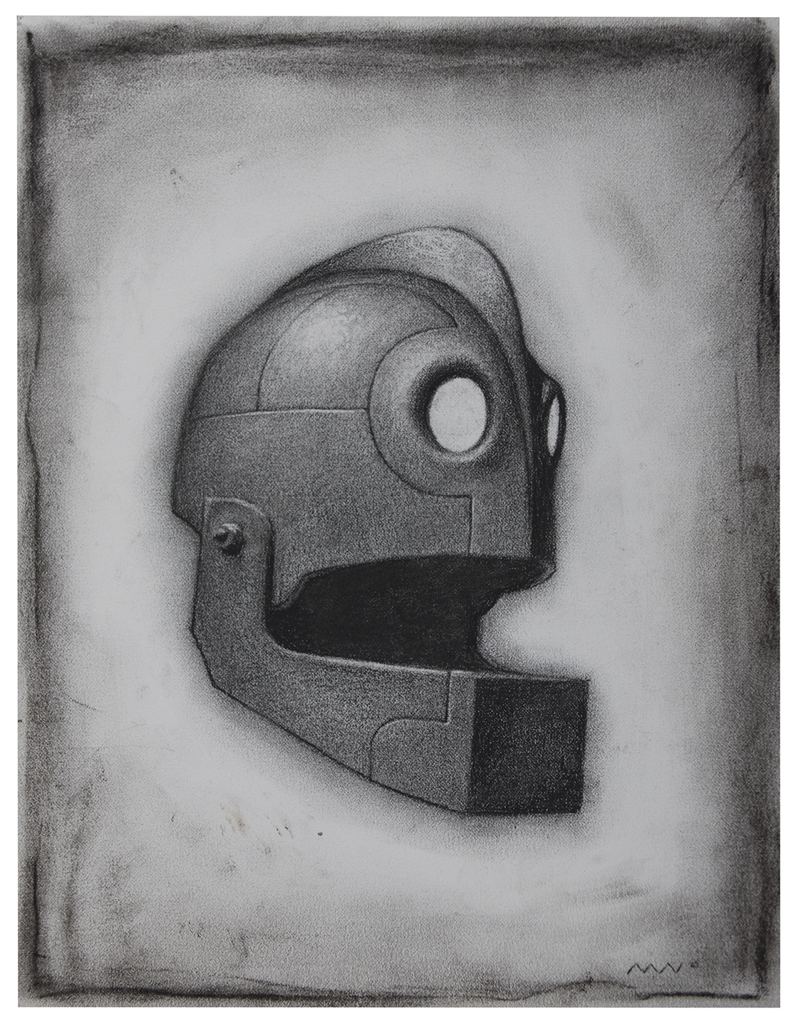
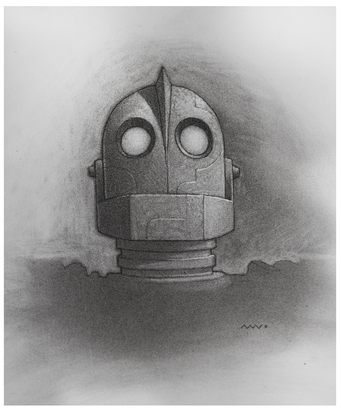
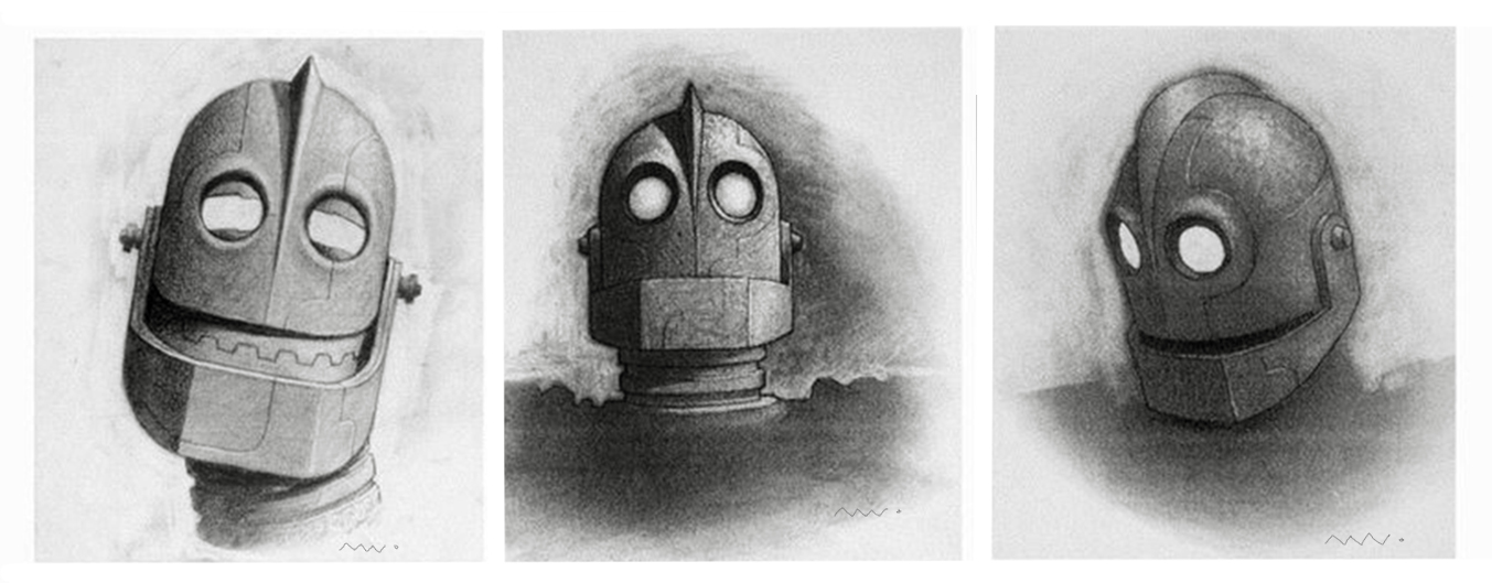
The lot was worried his face would not emote so Brad had me do maybe 8 of these head shots showing how his face can express.

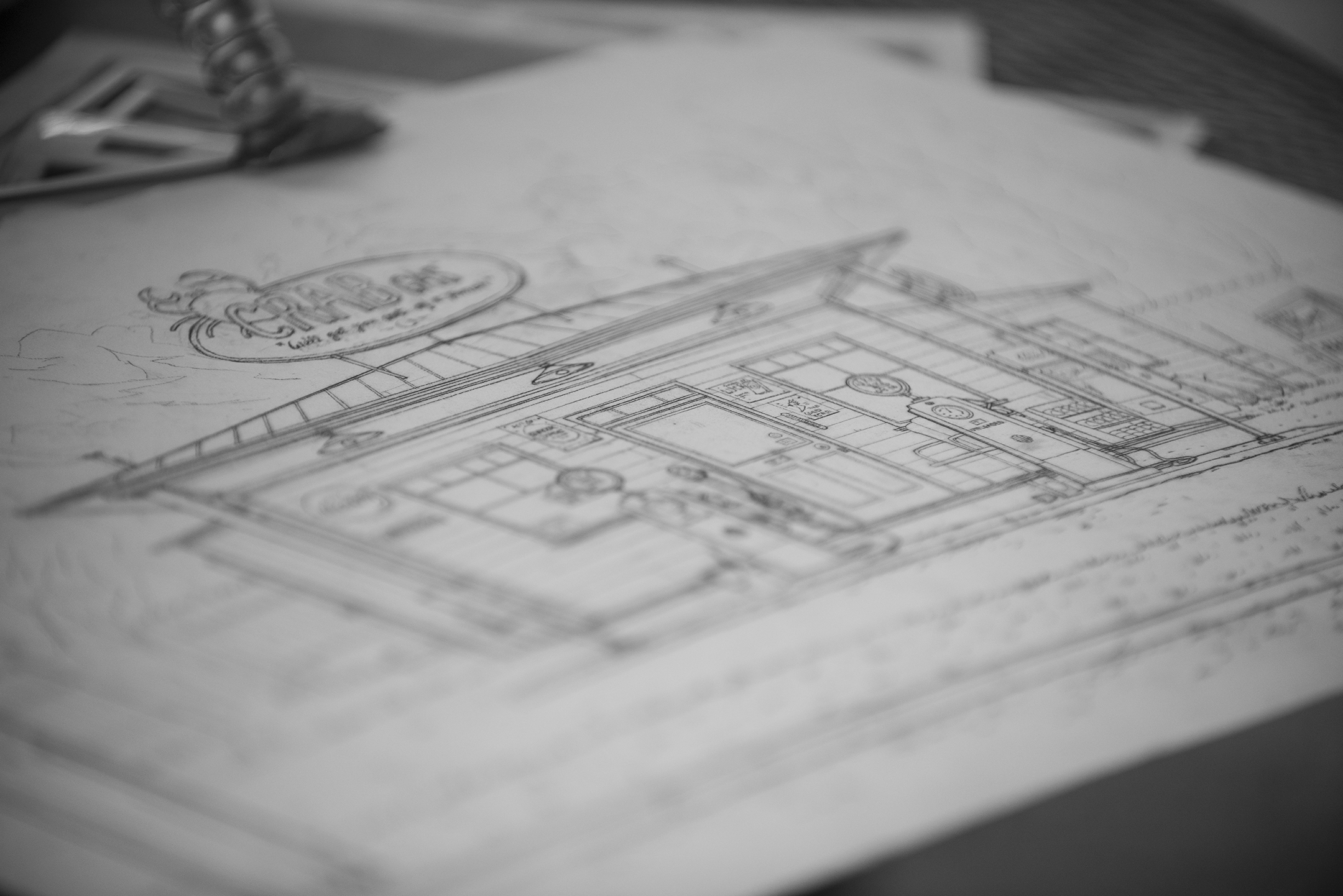
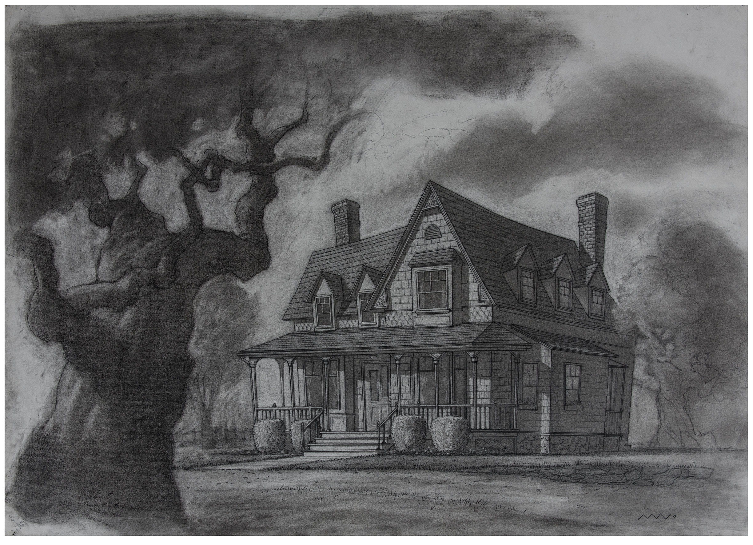
Hogarths house. The final design. I did 40 or 50 sketches of this joint before we found his home. I almost had time to finish those trees.

The back porch. i think we actually used this quick shot in the film. I was always pushing for thing we didnt have the budget for. like moths around bulbs and falling leaves.

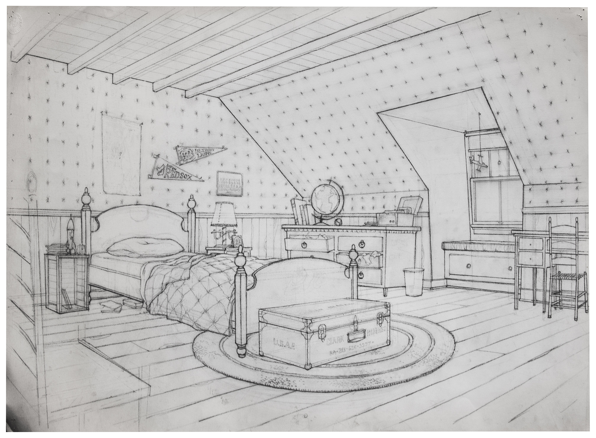
Hogarths room. earth tones below - starry wallpaper above. and a lions pennant on the wall? wtf? it was a hard sell but Maine didnt have a team and at the time the Lions were actually world champions so... score 1 for detroit. and thats his dead dads locker at the foot of the bed.

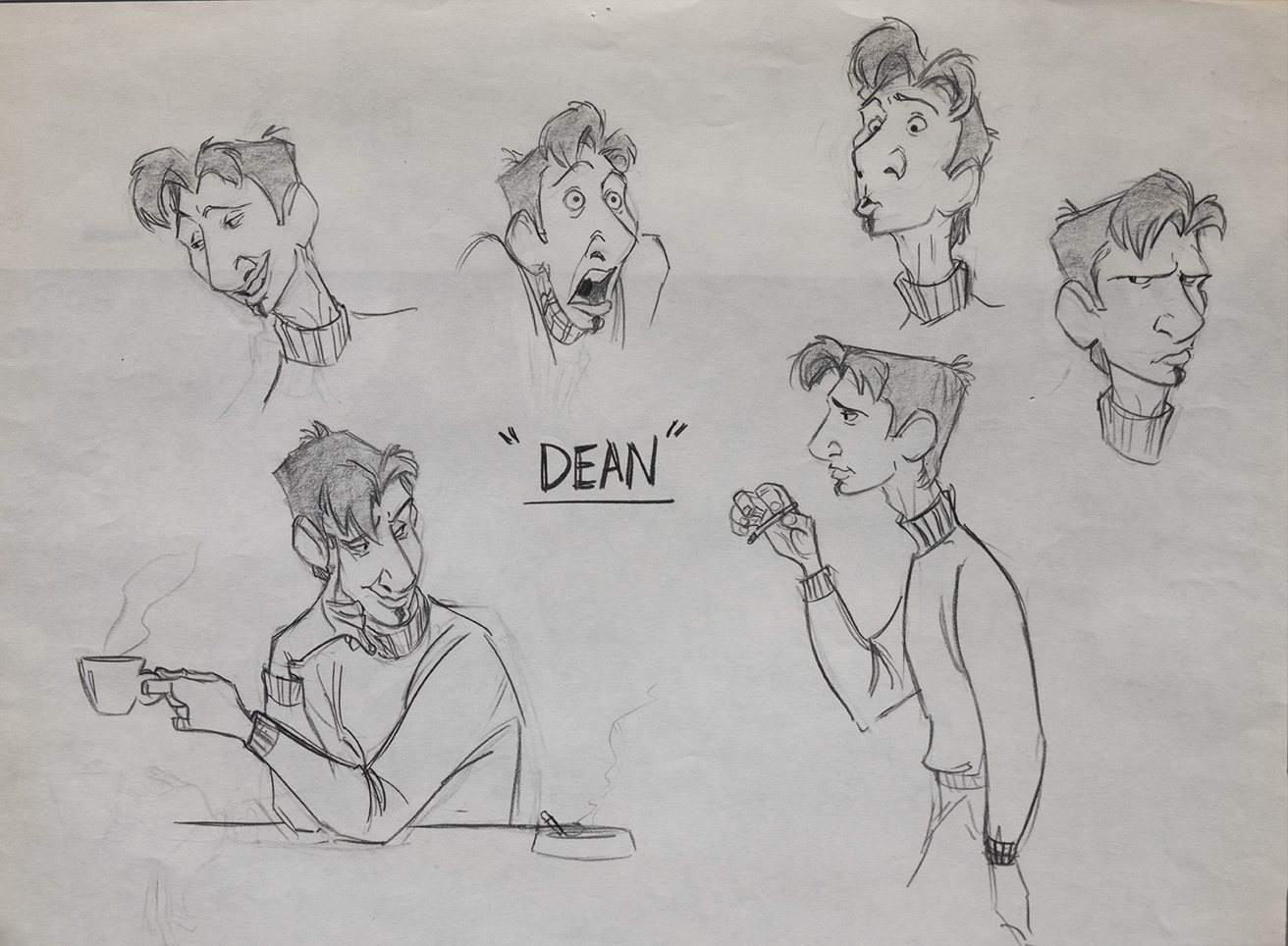
The unbelievably talented Dean Wellins did this early design of Dean Mcoppin. It's hard to imagine another Dean once you've seen the film but I actually preferred this nerdier 'Dobi Gillised' version at the time.

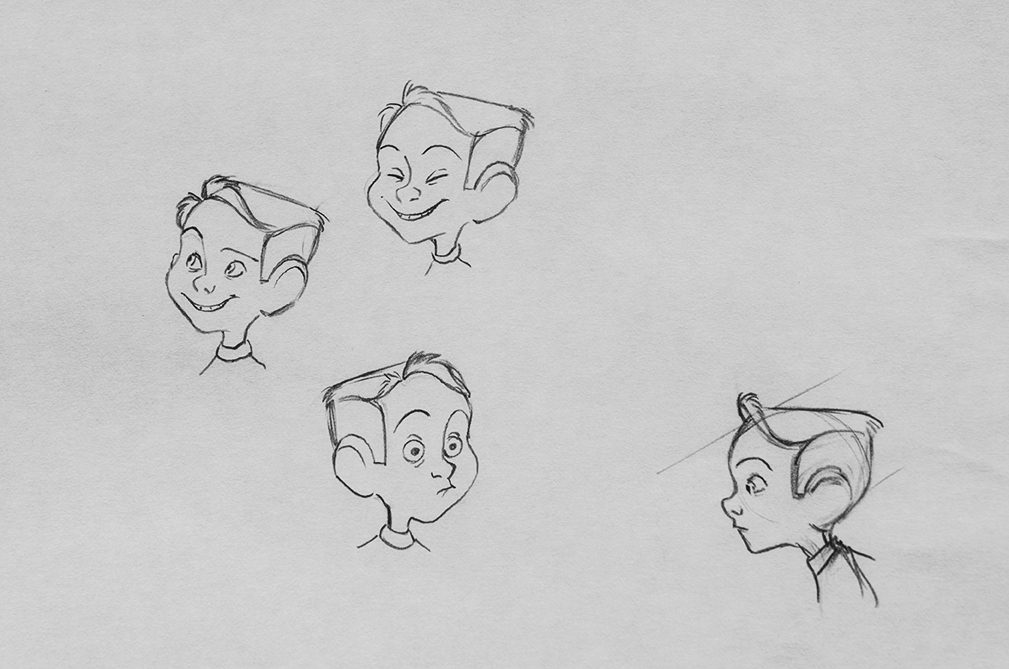
You should have seen how long Hogarhs hair was before i pleaded for a hair cut more along these lines. It didn'nt get this 50's crew cut but it got better. Memory erodes but i think Dean did this too but it may have been Tony Fucile.

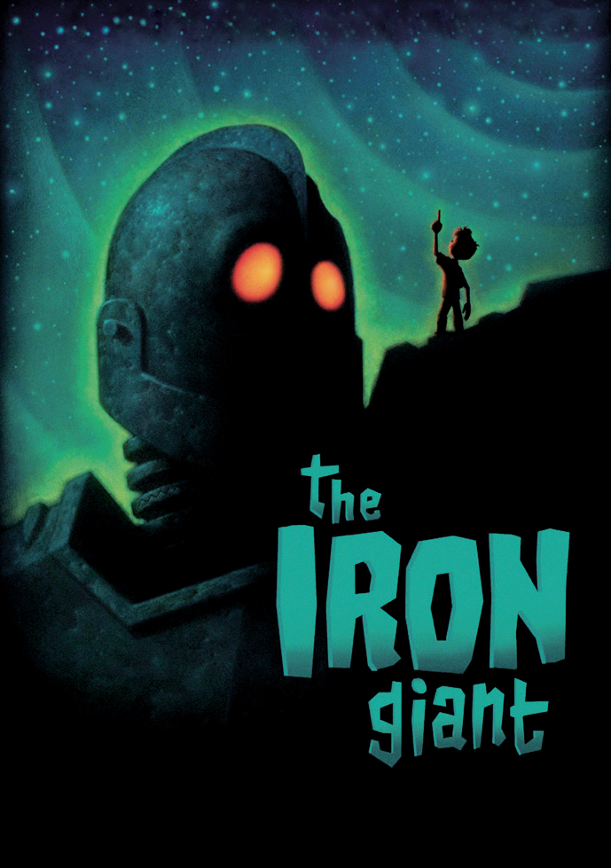
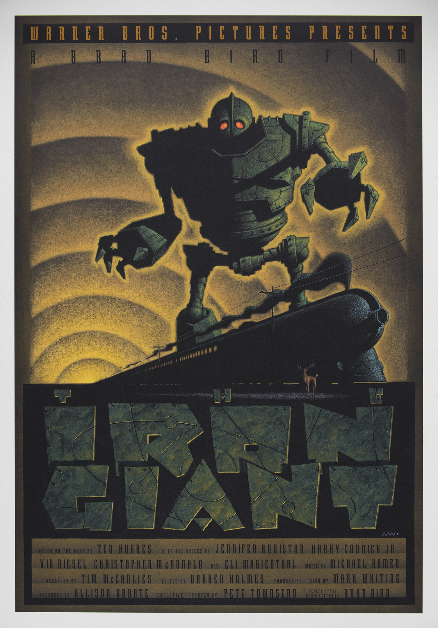
LIMITED EDITION WARNER BROS POSTER
20' x 30" Giclee on rag. Original acrylic on board.
Bird and I signed a few hundred of these one afternoon in North Hollywood. My version of a soviet poster. Early in development Russia was very much a presence in the story, but the studio didn't want to get political in an animated film. Kent was even a secret Russian spy who radioed Moscow from Hogarths's basement. Sadly only sputnik survived... and the sickle and hammer I carved over the giants heart in this poster.
This is the earliest artist proof, 1/1. Prior to the proofs we signed. The credits eventually got rearranged for the final version.
